Two windows on a blue wall
Photo by moshehar

No EXIF metadata in this file
Technical analysis based on visual assessment only.
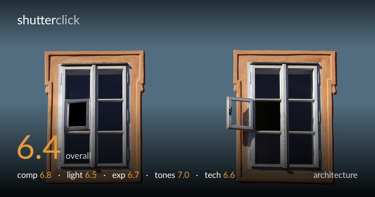
A clean, graphic study of two near-identical windows set against a flat wall, with the small open casement breaking the symmetry and giving the eye somewhere to land. The warm ochre frames against the muted blue-grey field read as a deliberate complementary pairing, and that's the image's strongest asset. What holds it back is that the wall appears digitally flattened — the uniform blue-grey looks composited rather than photographed, draining any sense of texture, place, or natural light. The two windows sit slightly low and the spacing feels arbitrary. As an architectural detail study it works graphically; as a document of a real building it loses authenticity.
The twin-window pairing builds a tidy symmetry, and the single open casement is the device that saves it from being purely repetitive — it pulls the eye and creates a small narrative. Both windows sit a touch low in the frame, leaving a heavy band of empty wall above. The negative space between them is generous but feels undirected rather than balanced. Centring each window in its own half works, yet a slightly higher placement or a tighter vertical crop would tighten the geometry and reduce the dead upper third.
Light comes from the upper left, casting the open casement's shadow cleanly across the glass and giving the frames modest dimension. The directional quality is decent and the cast shadow adds the only real depth cue in the scene. However, the wall reads as evenly lit to the point of flatness, with no falloff or gradient to suggest a real surface under natural light. That uniformity undercuts the believability and removes the subtle modelling that raking light across stucco would normally provide.
Exposure is well controlled overall. The white frames hold detail without blowing out, the dark glass panes retain just enough tone to read as recessed openings, and the open casement's interior goes appropriately black without crushing anything important. The bright ochre surrounds sit comfortably below clipping. The flat blue field carries no highlight or shadow information, which is consistent with its artificial appearance. Midtones on the frames are nicely placed and the dynamic range across the windows is handled cleanly.
The complementary relationship between warm ochre frames and the cool blue-grey backdrop is the picture's most appealing quality — it's a confident, restrained palette. White balance on the woodwork is neutral and clean, and the contrast between the bright frames and dark panes gives good separation. The blue field is uniform to a fault, reading as a solid fill rather than a textured wall, which flattens the tonal interest. A little tonal variation in that field would make the colour relationship feel earned rather than constructed.
Focus is sharp across both windows, with the frame profiles, hinges, and the open casement's edge all crisply rendered — depth of field is ample and well suited to a flat, parallel subject shot square-on. There's no visible motion blur or noise, and the white woodwork resolves fine grain and joinery detail. The verticals are largely true and the frames sit parallel to the image edges, which matters for architecture and is handled competently here. The main technical concern is the wall itself: its perfectly uniform blue-grey and the slightly hard, clipped edges where stucco meets sky suggest heavy retouching or a composited background rather than a photographed surface. That choice removes the texture, light falloff, and environmental context that would normally anchor an architectural shot in a real place. Shooting the actual wall in raking side light, or at minimum preserving its true surface texture, would lend the frames a believable setting and restore the sense of an inhabited building.
what would elevate it
tags
Shot something like this?
Expert photo critique, on demand — scored across six categories, EXIF-aware. Start with 3 free critiques, no credit card.
critique my photo — free