Two women in activewear on the lawn
Photo by Anilsharma26

No EXIF metadata in this file
Technical analysis based on visual assessment only.
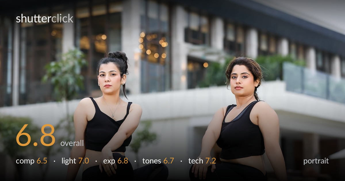
A competent two-subject lifestyle portrait, clean and professional, but held back by a static, posed feel and a slightly cluttered upper background. Both subjects are sharp and well separated from the softened building behind them, and the matching black activewear reads as a deliberate, cohesive concept. The frontal symmetry and identical direct gazes give it a catalogue look that works commercially but limits emotional interest. The bright sky and busy glass facade pull attention upward, away from the faces. Tighter framing and a touch more warmth and contrast would lift it from serviceable to striking.
The two figures are balanced left and right with the soft building anchoring the frame, a workable symmetrical layout for a paired fitness portrait. The wide grass foreground and generous headroom, however, leave dead space top and bottom while the busy glass facade competes for attention. Both subjects sit on roughly the same plane with near-identical poses, which reads static. Staggering their positions or varying the poses would build more visual rhythm. The bench and rocks intruding on the right edge clutter an otherwise clean background.
Soft, diffused light — likely overcast or open shade — renders skin evenly with no harsh shadows, flattering for both faces and consistent across the pair. Catchlights are present and the modelling on arms and shoulders gives gentle dimension. The trade-off is flatness: with light this even, the subjects lack the depth a hint of directional shaping would provide. The background sky is noticeably brighter than the foreground, hinting the exposure was balanced for the faces at the cost of a washed-out upper frame.
Faces and skin tones are exposed accurately with retained detail in the black clothing, no small feat given how easily dark fabric blocks up. Shadow detail on the legs and the grass holds well. The cost is the upper background: the sky and parts of the white facade are pushed toward overexposure, draining some texture from the building. Pulling highlights down in post would recover facade detail, and a graduated adjustment would tame the bright sky without darkening the subjects.
White balance is clean and neutral, with believable skin tones and a natural green in the grass. Contrast is on the gentle side, which suits the soft light but leaves the image feeling slightly flat overall. The black activewear stays neutral rather than going muddy or shifting blue. A modest contrast and warmth boost would add vitality, and deepening the blacks slightly would give the figures more weight against the pale background. Saturation is restrained and tasteful.
Focus is accurately placed on both subjects, with the eyes and facial detail sharp on each — important in a two-person frame where one is easily missed. The depth of field is judged well: shallow enough to dissolve the building into pleasant bokeh, with the warm window lights rendering as soft circular highlights, yet deep enough to keep both seated figures crisp across slightly different distances. That suggests a sensible aperture and a focal length around short-telephoto, which also gives flattering, non-distorted facial proportions. Noise is not an issue and the grass texture in the foreground holds fine detail. The main technical observation is the depth of field at the edges — the rocks and bench on the right remain just defined enough to distract. A slightly wider aperture or repositioning would have melted them away entirely. Overall the execution is clean and controlled, the kind of reliable technical baseline that lets the creative decisions carry the image.
what would elevate it
tags
Shot something like this?
Expert photo critique, on demand — scored across six categories, EXIF-aware. Start with 3 free critiques, no credit card.
critique my photo — free