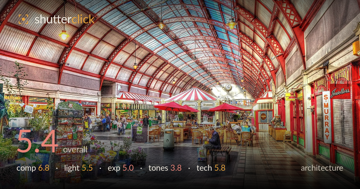
Under the arched market roof
Photo by 5477687

No EXIF metadata in this file
Technical analysis based on visual assessment only.
The greatest weakness here is the heavy HDR processing, which flattens depth, introduces halos along every edge, and turns natural material into a synthetic, over-textured surface. The underlying architecture is genuinely worth photographing: the arched glazed roof and its red ironwork sweep the eye down the arcade with real energy, and the receding tiled floor anchors a strong vanishing point. But the tone mapping crushes the sense of light and air that a Victorian market hall depends on. Pulled back to a natural rendering, with converging verticals corrected, this becomes a far cleaner and more convincing interior study.
The arched roof and its ironwork form a strong repeating rhythm that carries the eye down the arcade, and the tiled floor's perspective reinforces the vanishing point effectively. The seated figure on the bench gives welcome human scale and a natural resting point. Balance leans slightly right, where the S. Murray signage and shopfronts crowd the frame while the left flower stall competes for attention. A slightly higher shooting position or a touch more centring of the roof apex would settle the symmetry the architecture is clearly offering.
The glazed roof floods the hall with soft, even daylight, which suits the space, but the HDR treatment has erased most of the tonal direction that would give the ironwork and vaulting dimension. Highlights in the skylights and shadows in the aisles have been compressed toward the same value, so the light reads flat and directionless. The warm hanging lamps offer some counterpoint but are overwhelmed by the processing. A gentler rendering would let the daylight actually model the arches and reveal the recession into the far end.
The tone mapping has pushed the whole frame toward a uniform midtone, sacrificing genuine dynamic range for the appearance of it. Skylights that should carry bright highlight detail sit muted, while shadow areas under the shopfronts are lifted until they lose weight and grounding. The result is a histogram bunched in the middle with little true black or clean white. A single well-exposed frame, or a more restrained blend, would restore the highlight-to-shadow separation the interior needs to feel three-dimensional.
This is where the image most works against itself. Saturation is pushed to a near-cartoon level, the reds glowing unnaturally and the greens of the flower stall turning acidic. Local contrast enhancement leaves visible halos around the ironwork and roof edges, and fine textures take on a gritty, over-sharpened crunch. White balance drifts warm and inconsistent across the frame. Dialling saturation and clarity well back, and using a neutral, consistent white balance, would let the genuine colour of the painted ironwork breathe rather than shout.
Depth of field is not the issue; the wide framing keeps foreground flowers and the distant clock acceptably sharp. Focus lands cleanly across the arcade. The dominant technical concern is the processing pipeline rather than capture. The HDR merge or single-frame tone map has introduced edge halos, amplified noise into a textured grain across smooth surfaces, and over-sharpened the ironwork until it reads brittle. Verticals also lean inward at the frame edges, the classic keystoning of an upward-tilted wide lens, which architecture work rewards correcting. A tripod-mounted frame with a levelled camera, or lens-correction in post, would straighten those uprights. The exposure blend itself is competent in coverage but excessive in application. Restraint in the tone-mapping stage, a lower clarity and structure setting, and perspective correction would recover a natural, detailed interior from what is currently an over-cooked one. The raw material and vantage point are sound; the finishing does most of the damage.
What would elevate it
Tags
Shot something like this?
Expert photo critique, on demand — scored across six categories, EXIF-aware. Start with 3 free critiques, no credit card.
critique my photo — free