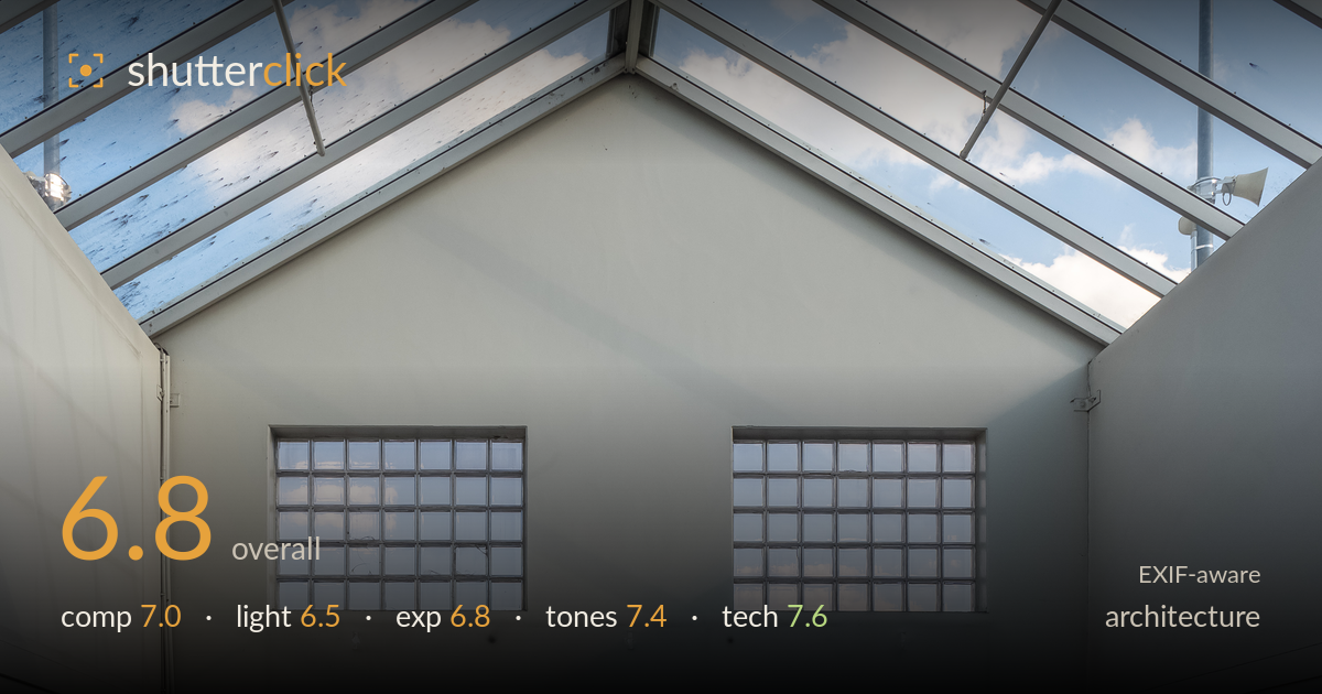
Under the glass gable roof
Photo by Ermell

| Focal length | 12 mm |
| Aperture | f / 6.3 |
| Shutter | 1/200 s |
| ISO | ISO 200 |
| Exp. comp. | 0.0 EV |
| Shot at | 17:14 · Apr 17, 2018 |
A clean, symmetrical interior study built around the gable geometry of the glazed roof and the diamond-tiled wall — the blue accents (roof beam, tile motifs, CineStar sign) give it a coherent palette and a sense of order. The verticals are well controlled and the frame is squared up honestly. What most holds it back is the tension between the blown skylight highlights and the flatly lit lower wall: the eye has no single resting point, and the escalator handrails intruding at the bottom edge feel like an afterthought rather than a deliberate foreground. A cleaner base and tamed highlights would lift this from documentation toward statement.
The gable apex is centred and the glass-block windows sit as a balanced pair, giving the frame strong bilateral symmetry that suits the subject. The diagonal roof struts converging on the apex are the strongest graphic element. The escalator handrails cutting into the bottom edge, though, are awkward — neither a clean foreground anchor nor fully excluded, they clutter the base. The blue diamond tile motifs are pleasant but sit low and slightly off-balance left to right, leaving the lower third feeling busier than the elegant upper half.
Daylight floods through the skylight and glass-block windows, which is authentic to the space but uneven in effect. The upper glazing is far brighter than the lower wall, so the tonal weight sits at the top while the tiled base falls into flat, shadowless illumination that reads as documentary rather than shaped. The soft, diffuse quality flatters the white surfaces but gives the diamond tiles and the sculptural blue motifs little modelling. Overcast-to-partly-cloudy light limits contrast where a directional beam would have carved out the geometry.
A reasonable compromise given the enormous range between backlit sky and shaded interior. The skylight and glass blocks clip in patches, losing cloud detail, but the loss is contained and the interior retains full shadow information without muddiness. Midtones on the white wall sit a touch high, edging toward washed-out, yet nothing important is buried. This is a difficult single-frame exposure and the decision to protect the interior over the sky is defensible. Bracketing would have recovered the brightest cloud highlights around the roof ridge.
The restrained blue-and-white palette is the image's biggest strength — the cobalt roof beam, sky blues through the glass, and the graduated diamond tiles all share a cohesive cool register that ties the frame together. White balance is clean and neutral on the walls. Contrast is gentle, appropriate to the airy space, and the tile gradient from pale to saturated blue reads well. The whites could carry a fraction more warmth or depth to avoid feeling slightly clinical, but the colour discipline here is genuinely accomplished.
The settings are well matched to the subject. At 12mm the E-M1 Mark II delivers the wide coverage this interior demands, and f/6.3 sits in the lens's sweet spot, holding sharpness edge to edge with ample depth of field for a static architectural scene — everything from the tiles to the roof struts is crisp. ISO 200 keeps noise negligible and preserves clean tones in the white walls. At 1/200s handholding was safe with no visible shake. Focus is accurate across the plane. The main technical consideration is dynamic range: a single exposure could not hold both the bright sky and the interior, so the skylight clips. A bracketed sequence blended in post, or a graduated approach, would have captured the full range this scene contains. Verticals are commendably straight for a 12mm wide angle, suggesting either careful levelling or corrected perspective — the near-absence of keystoning is a real technical win here.
What would elevate it
Tags
Shot something like this?
Expert photo critique, on demand — scored across six categories, EXIF-aware. Start with 3 free critiques, no credit card.
critique my photo — free