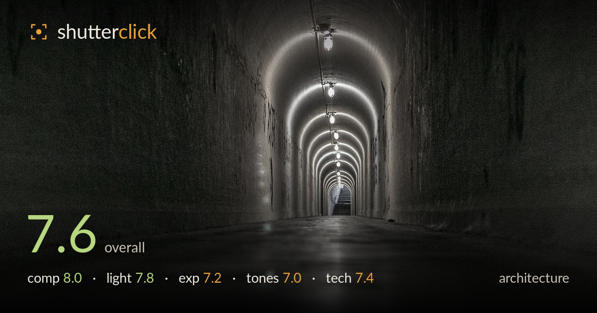
Vanishing point down the tunnel
Photo by OrlandoSantana

No EXIF metadata in this file
Technical analysis based on visual assessment only.
A confident use of one-point perspective drives the eye straight down the tunnel, with the string of lamps and their glowing arches carrying depth cleanly to the distant exit. The graphic strength of the receding geometry is the picture's clear reward. What holds it back most is the flat, slightly muddy midtone rendering and a foreground that reads soft and empty — the lower third of the frame carries reflection but little sharp detail. Tightening tonal separation and grounding the composition with a crisper, more purposeful floor would lift a strong idea into a polished frame.
The one-point perspective is the backbone here, and it works: the vanishing point sits just left of centre with the distant lit exit as a natural terminus, and the repeating lamps form a rhythmic spine down the ceiling. The curved walls funnel the eye convincingly. The symmetry is close but not perfect — the left wall reads darker and heavier than the right, and the foreground floor occupies a large, feature-poor share of the frame. A slightly lower or more centred camera position would balance the walls and give the floor purpose.
The lamps are the whole lighting story, and their pooled glow against the concrete creates those graceful overlapping arches that give the ceiling its rhythm. The falloff into the dark walls builds atmosphere and mystery. The lamps closest to camera flare slightly and blow their bulbs, and the distant exit light is a pleasing cool accent against the warmer tunnel interior. Direction is fixed and unavoidable, but the balance between the bright lamp line and the shadowed walls is well judged for a moody, subterranean read.
Exposure holds a wide range, from the deep shadowed walls to the small blown lamp bulbs. The bulbs clip, which is acceptable given point sources, but the surrounding halos verge on harsh. Shadow detail on the walls survives without becoming pure black, preserving texture. The floor midtones sit slightly flat and grey, lacking a true anchoring black point in the foreground. A touch more shadow density in the lower corners and a hair less lift in the floor would give the exposure more punch and dimensionality.
The near-monochrome palette suits the concrete and reinforces the cold, industrial mood, with only a faint warm-cool split between the lamps and the distant exit. Tonal separation in the midtones is the weak point — the floor and lower walls muddy together into a similar grey, flattening the sense of surface. Contrast is moderate but could push further to make the lit arches sing against the dark. The rendering reads slightly desaturated and hazy overall; a cleaner tonal curve would sharpen the graphic contrast the geometry deserves.
Focus appears set toward the middle distance, keeping the lamp line and receding walls acceptably sharp, which is the right call for carrying the eye to the exit. The foreground floor, however, reads soft — whether from depth of field or motion during a longer handheld exposure, the lower third lacks crisp texture, and that softness undercuts the grounding of the frame. The low, near-floor camera angle exaggerates the perspective effectively but demands that the near ground be sharp to pay off. Noise is controlled in the shadows, suggesting a reasonable ISO or careful processing, and the concrete texture on the walls holds up well under the lamplight. Depth of field looks sufficient to keep the tunnel's length legible. A smaller aperture with a tripod and a longer exposure would render the entire floor-to-exit run sharp and let the reflections resolve cleanly rather than smearing. Overall execution is solid, with the foreground softness the main technical shortfall.
What would elevate it
Tags
Shot something like this?
Expert photo critique, on demand — scored across six categories, EXIF-aware. Start with 3 free critiques, no credit card.
critique my photo — free