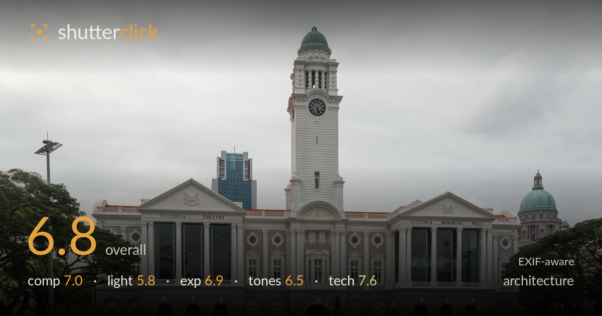
Victoria theatre under a grey sky
Photo by Marcin Konsek

| Focal length | 32 mm |
| Aperture | f / 9.0 |
| Shutter | 1/160 s |
| ISO | ISO 200 |
| Exp. comp. | 0.0 EV |
| Shot at | 10:27 · Feb 10, 2016 |
A clean, disciplined frontal documentation of Victoria Theatre and Memorial Hall with the clock tower centred and verticals kept commendably straight. The symmetry is the frame's greatest asset, reinforced by the trees flanking each edge and the sweep of foreground lawn leading to the central statue. What most holds it back is flat, overcast light that mutes the façade's relief and delivers a heavy, featureless white sky occupying the top third. The lower-third crop of lawn is generous to the point of emptiness. Stronger raking light and a tighter sky would lift this from a competent record shot toward something with atmosphere.
The near-perfect symmetry suits the building's formal Palladian frontage, with the clock tower dead-centre and the twin pediments balancing left and right. Framing trees at both edges neatly contain the composition. The central statue and paved forecourt give the eye a landing point. However, the foreground lawn eats roughly the bottom third with little detail or interest, and the blank sky claims a similar share up top, squeezing the subject into a central band. A lower horizon or tighter vertical crop would let the architecture command more of the frame.
Flat, diffuse overcast light is the main limitation here. It renders the white façade evenly and avoids blown highlights, but it also flattens the deep relief of columns, cornices and the tower's tiers, robbing them of the shadow modelling that gives classical architecture its three-dimensional presence. The sky is a featureless pale grey, adding no tonal interest. Directional light, whether low morning or late-afternoon sun raking across the front, would carve out the ornamentation and separate the tower from the sky far more convincingly.
Exposure is well judged for the difficult bright-sky, mid-tone-building scenario. The white façade holds detail without clipping, the shadowed arcade at the base retains information, and the green lawn is rendered richly without oversaturation. The sky is bright but not fully blown, preserving faint cloud structure. Midtones sit comfortably. If anything, the frame could carry a touch more contrast to counter the overcast flatness, but the underlying exposure decisions are sound and the dynamic range is handled cleanly across a wide brightness spread.
White balance is neutral and believable, with the copper domes reading a natural verdigris and the lawn a convincing green. Tonal range is somewhat compressed by the flat light, leaving the whites and greys of the building close in value and the overall image slightly low in contrast. The grey sky drains vibrancy from the upper frame. A gentle contrast lift and selective dodging of the façade shadows would restore some separation between the building's planes and add the punch the diffuse light withholds.
Technically this is executed well. At 32mm on the full-frame 6D the perspective is natural, and f/9 is an ideal aperture choice for front-to-back sharpness across a subject at this distance, keeping both the near lawn and the distant tower crisp. ISO 200 keeps noise negligible, and 1/160s is more than adequate for a static handheld frontal shot with the IS lens assisting. Focus appears accurate across the façade, and detail in the stonework, clock face and window mullions resolves cleanly. Most impressively, the verticals are kept notably straight for this focal length, suggesting careful levelling or subsequent correction; the columns and tower edges show minimal keystoning, which is exactly what architectural work demands. The 24-105 f/4L is a sensible lens for the job. The only technical caveat is that a shift lens or a slightly more distant vantage would eliminate the last traces of convergence entirely, but as shot the discipline is strong.
What would elevate it
Tags
Shot something like this?
Expert photo critique, on demand — scored across six categories, EXIF-aware. Start with 3 free critiques, no credit card.
critique my photo — free