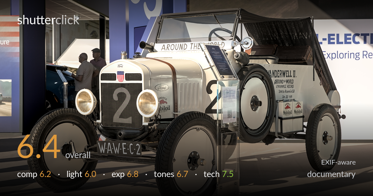
Vintage ford around-the-world racer on display
Photo by Alexander-93

| Focal length | 50 mm |
| Aperture | f / 7.1 |
| Shutter | 1/250 s |
| ISO | ISO 100 |
| Exp. comp. | 0.0 EV |
| Shot at | 14:50 · Sep 5, 2023 |
A clean, well-executed record shot of a historic Vanderwell II Ford that documents the vehicle thoroughly but stops short of telling its story. The three-quarter angle reads the car well and the front-left placement is solid, but the cluttered exhibition backdrop — signage, bystanders, an acrylic info stand cutting across the front wheel — competes with the subject and dilutes the documentary intent. Hard midday-style stand lighting flattens the silver bodywork and throws busy shadows across the floor. Sharp, properly exposed, and faithful in colour, it works as a catalogue image. What holds it back is context that distracts rather than supports.
The three-quarter front-left angle is the right choice, showing grille, number, livery and cabin in one read, and the car fills the frame with authority. But the surrounding environment fights the subject: the acrylic information stand sits awkwardly across the front wheel, the booth signage and bystanders crowd the upper left, and the cropped vehicle at far right adds clutter. The strong floor shadows lead the eye outward rather than inward. A tighter angle or shallower depth that suppressed the booth would let the car stand on its own.
The light is hard, directional show-floor illumination raking from the upper left, producing crisp but busy cast shadows across the floor and uneven gradation on the silver panels. It models the rounded hood and tyres adequately and the highlights on the brass and headlamps have life, but the overall quality is flat and unflattering for a reflective surface. The mixed daylight spilling from the left adds a second shadow direction that complicates the read. Softer, more frontal or diffused light would render the bodywork more evenly.
Exposure is well judged for a bright subject. The white-to-silver bodywork holds detail without blowing out, and the dark grille and tyres retain texture rather than blocking up. The histogram looks well spread, with the brightest livery panels near but not over the clipping point. Shadow areas under the chassis stay readable. Only the small spectral highlights on the brass radiator cap and headlamp rims clip, which is acceptable. A deliberate, even rendering across a tricky high-contrast subject — no exposure compensation was needed and none would have helped.
White balance is accurate, with neutral silver panels and believable warm tones in the brass, leather strap and wood. Contrast is moderate and the tonal range runs cleanly from the deep grille black to the bright livery. The muted, slightly desaturated palette suits the documentary register and lets the historic signage read clearly. The blue booth backdrop is the only saturated note and it pulls some attention. A touch more separation between the silver car and the pale floor would strengthen the tonal hierarchy.
Settings are well matched to the task. At f/7.1 on a 50mm lens, depth of field is sufficient to hold the entire car sharp from the front axle to the rear wheel while still softening the background enough to avoid total competition — a sensible compromise for a static subject of this depth. Focus is accurately placed on the grille and number plate, the most information-rich area. 1/250s at ISO 100 on the 5D Mark IV is ample for a stationary vehicle and keeps noise nonexistent, with clean shadows and crisp detail in the radiator mesh and tyre treads. The 24-70mm at 50mm avoids wide-angle distortion of the proportions, an appropriate focal length. The one technical limitation is environmental rather than mechanical: the chosen aperture keeps the booth signage and bystanders just legible enough to distract. A wider aperture, around f/4, would have thrown the background further out while still covering the car's critical planes.
what would elevate it
tags
Shot something like this?
Expert photo critique, on demand — scored across six categories, EXIF-aware. Start with 3 free critiques, no credit card.
critique my photo — free