Vw tower framed in steel
Photo by chris_muschard

No EXIF metadata in this file
Technical analysis based on visual assessment only.
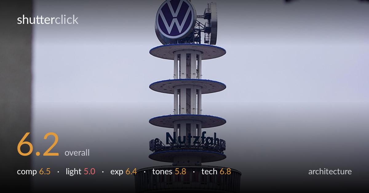
A clean, vertically centred study of a telecommunications tower framed by industrial steelwork — the framing device gives the shot a sense of place, but flat overcast light leaves it without dimension. The tower's stacked discs and the VW logo make a strong central anchor, and the foreground solar panels add an unexpected layer of context. What most holds it back is the dead grey sky and lack of tonal separation: the tower nearly merges into its backdrop. The top steel beam is heavily cropped and reads as clutter rather than deliberate frame, and the panel strip along the bottom feels like an afterthought.
The tower sits dead-centre and stands tall, which suits the subject's symmetry and the stacked-disc geometry. The dark steel beams across the top act as a framing device that adds depth and grounds the image in an industrial setting. The strip of solar panels along the bottom edge gives foreground layering and context. However, the heavy concrete pillar on the left and the cropped beam at top right feel uneven and crowd the frame more than they support it. A cleaner relationship between frame and subject would sharpen the intent.
Flat, diffuse overcast light is the chief limitation here. It renders the tower's curved surfaces and the discs without modelling — everything sits in the same soft grey register, so the structure loses the three-dimensional separation that raking or directional light would give. The white concrete shaft and the pale sky end up at near-identical brightness, flattening depth. There are no shadows shaping the form, no highlight sparkle on the metalwork. Shooting at a different hour, with low side light or a brighter sky, would transform the modelling.
Exposure is handled competently for the conditions. The tower retains detail across its shaft and discs, and the dark steel beams hold shadow information without crushing to pure black. The sky is bright but not blown — it reads as the flat grey it actually is. The VW logo and the red panel band keep their colour. The main consequence is that the overcast sky occupies a narrow tonal band that offers little contrast to play against, so the histogram bunches in the upper-mids. A deliberate choice, but a constrained one.
The palette is muted and cool, dominated by greys and pale blues that match the dreary sky. The VW blue and the red accent on the observation deck provide the only colour relief and read accurately. White balance leans slightly cool, reinforcing the overcast mood, which is defensible but adds to the overall flatness. Contrast is low across the board — the tower, sky, and concrete all sit close together tonally. A touch more local contrast on the structure, or a warmer grade, would lift it from grey monotony.
Focus is placed accurately on the tower, and the stacked discs, the lettering, and the lattice antenna all hold crisp detail, which is the priority for an architectural subject like this. The framing steel beams in the foreground show slightly softer rendering, suggesting a moderate telephoto compressing the scene and throwing the nearest elements marginally out of the focal plane — a reasonable trade that keeps the main subject sharp. Verticals on the tower shaft read acceptably straight, with no obvious keystoning, which matters for this genre. Noise is well controlled and the image is clean at viewing size. The long focal length compresses the tower against the sky and the foreground beams effectively, isolating the structure. The main technical opportunity lies less in execution than in conditions: there is little a lens or sensor can do about the absence of directional light. A polariser would have done little under full overcast, but a brighter day would have rewarded the same careful focus work with far more separation.
what would elevate it
tags
Shot something like this?
Expert photo critique, on demand — scored across six categories, EXIF-aware. Start with 3 free critiques, no credit card.
critique my photo — free