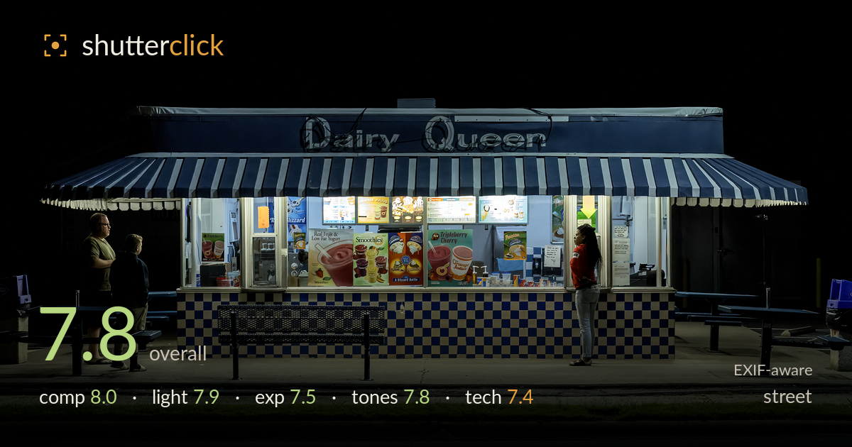
Waiting at the dairy queen window
Photo by Acroterion

| Focal length | 46 mm |
| Aperture | f / 5.6 |
| Shutter | 1/80 s |
| ISO | ISO 1600 |
| Exp. comp. | -0.67 EV |
| Shot at | 19:49 · Oct 5, 2016 |
A quietly observed night-time tableau where a lit-up storefront becomes a stage. The frontal, symmetrical framing of the Dairy Queen counter turns fluorescent glow into the whole light source, and the human triangle — two figures at left, one at right — gives the frame narrative tension and a sense of waiting. The black upper half is bold but eats a lot of the frame without adding information. The strongest asset is the found stage lighting and the honest, unposed moment. What holds it back most is the vast dead sky and a slightly soft, noisy capture at ISO 1600. Cropping the void and refining figure placement would sharpen it further.
The dead-on, symmetrical framing suits the subject: the counter reads like a lit stage and the awning's zigzag anchors the top edge. The figure grouping works — two at left, one at right — creating a story across negative space. The empty picnic tables reinforce the after-hours emptiness. But the upper black band consumes nearly half the frame with no detail, top-heavying the composition. The green grass strip and road at the bottom add welcome grounding. Slightly more headroom trimmed and less void would tighten the balance considerably.
The entire image runs on the storefront's fluorescent spill, and it's used well — the glowing menu boards and interior act as a soft box that models the figures and the checkerboard base. The falloff into surrounding darkness gives natural vignetting and isolates the scene like a diorama. Colour temperature reads cool blue-green, appropriate to the source and the night mood. The trade-off is flatness on the figures, who catch only ambient bounce; the woman in red is lit better than the pair at left, who fall slightly into shadow.
Exposure is well judged for a high-contrast night scene. The lit menu boards and window signage hold colour and legibility without blowing out, and the -0.67 EV compensation helped protect those bright interior highlights. Shadow areas are deep but retain enough separation on the figures and tables to read. The vast black sky is a deliberate void rather than a recovery problem. Some crushed detail in the darker figures at left is the only minor loss, and lifting those shadows slightly would recover presence without flattening the mood.
The cool blue-green cast from the fluorescents sets a consistent, cinematic night palette, and the pops of colour — the red shirt, the yellow menu boards, the printed signage — punctuate it effectively. The blue-and-white checkerboard base and striped awning tie the whole frame together tonally. Contrast is high by nature of the scene, and the balance between the illuminated stage and surrounding black holds up. White balance leans cold but reads as intentional and atmospheric rather than an error. Mid-tone gradation on the pavement is smooth.
The settings are a sensible compromise for a static night scene. At f/5.6 and 46mm, depth of field comfortably covers the flat storefront plane, and everything on that plane is acceptably sharp. ISO 1600 on the SL1's sensor introduces visible luminance noise in the shadows and the black sky, which is where the file feels least clean — noise reduction is doing some work and softening fine detail slightly. 1/80s is enough to hold the mostly stationary figures without blur, though it left little margin. Focus lands on the counter and signage well. The 15-85mm at this focal length renders the frontal geometry cleanly with minimal distortion. Overall a competent capture; a lower ISO with a tripod, given the static subject, would have delivered a noticeably cleaner file with more shadow detail to work with. Nothing here is a mistake — the choices suit a handheld grab of a fleeting scene, just at the cost of some cleanliness.
What would elevate it
Tags
Shot something like this?
Expert photo critique, on demand — scored across six categories, EXIF-aware. Start with 3 free critiques, no credit card.
critique my photo — free