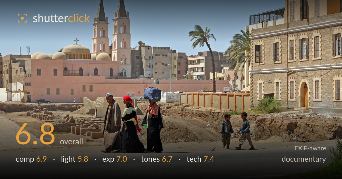
Walking past the coptic church
Photo by Marc Ryckaert

| Focal length | 55 mm |
| Aperture | f / 9.0 |
| Shutter | 1/500 s |
| ISO | ISO 200 |
| Exp. comp. | 0.0 EV |
| Shot at | 11:24 · Mar 16, 2012 |
A genuine sense of place carries this frame: the twin-spired Coptic church, the palm, and two groups of walking figures build a layered street-life narrative against an Egyptian townscape. The two figures balancing luggage and the woman in red add welcome colour and gesture. What holds it back most is the flat, high, midday sun, which drains modelling from the architecture and leaves the scene evenly lit rather than shaped. The gap of dead road between the family and the two boys splits the human interest awkwardly, and the empty foreground asphalt eats frame without contributing. Strong material, waiting on better light and a tighter moment.
The layering works: pedestrians in the foreground, excavated ground and ruins mid-frame, church spires and buildings behind. The palm anchors the right-of-centre sky nicely and the church breaks the horizon well. The trouble is the divided human interest, the family and the two boys occupy separate pockets with a large empty stretch of road between them, so the eye ping-pongs rather than settling. The broad foreground asphalt contributes little. A moment where the two groups related, or a tighter crop from the bottom, would consolidate the storytelling.
This is the weakest link. Overhead midday sun renders the whole scene evenly and flatly, flattening the church towers, the brick building, and the figures alike. Shadows fall straight down and short, giving little three-dimensional form to the architecture that could otherwise be a highlight. The blue sky is clean but featureless. Earlier or later light, raking across the spires and stone facade, would carve out texture and warmth and lend the town depth that the current flat illumination denies it.
Exposure is handled well for harsh conditions. Highlights on the pale church wall and bright road hold detail without clipping, and the shadow sides of the darker robes retain information. The bright sky is bright but not blown. Midtones sit comfortably across the sandy buildings. Nothing here reads as accidental, the balance across a high-contrast midday scene is deliberate and controlled. If anything, a touch more shadow lift on the figures' faces would help them read against the busy backdrop.
The palette is coherent, warm sandstone and pink church tones under a clean blue sky, with the woman's red headscarf and the blue bag providing useful colour accents. White balance looks accurate for direct sun. Contrast is on the flatter side, an inevitable consequence of the overhead light, so the image lacks tonal punch. Saturation is natural and restrained, which suits the documentary intent. A modest contrast and clarity lift in post would give the earthy tones more separation and presence.
The settings are well chosen for a bright daylight street scene. f/9 at 55mm on the DX sensor delivers deep front-to-back sharpness, appropriate here since both the walking figures and the church behind matter to the story, everything reads acceptably crisp. 1/500s comfortably freezes the walking pace, no motion blur on the striding figures or the boys. ISO 200 keeps noise negligible and holds good tonal quality in the sandy midtones. The 55mm focal length gives a natural, non-distorted perspective that suits documentary framing. Focus appears accurate on the foreground group. The one execution point worth noting: at f/9 in flat light there is little to isolate the subjects from the equally sharp, busy background, so the figures compete with the townscape for attention. That is a lighting-and-moment issue more than a settings error, the exposure triangle itself is sound. Solid, reliable technical execution throughout.
What would elevate it
Tags
Shot something like this?
Expert photo critique, on demand — scored across six categories, EXIF-aware. Start with 3 free critiques, no credit card.
critique my photo — free