Warm afternoon over the city grid
Photo by Herrfilm

No EXIF metadata in this file
Technical analysis based on visual assessment only.
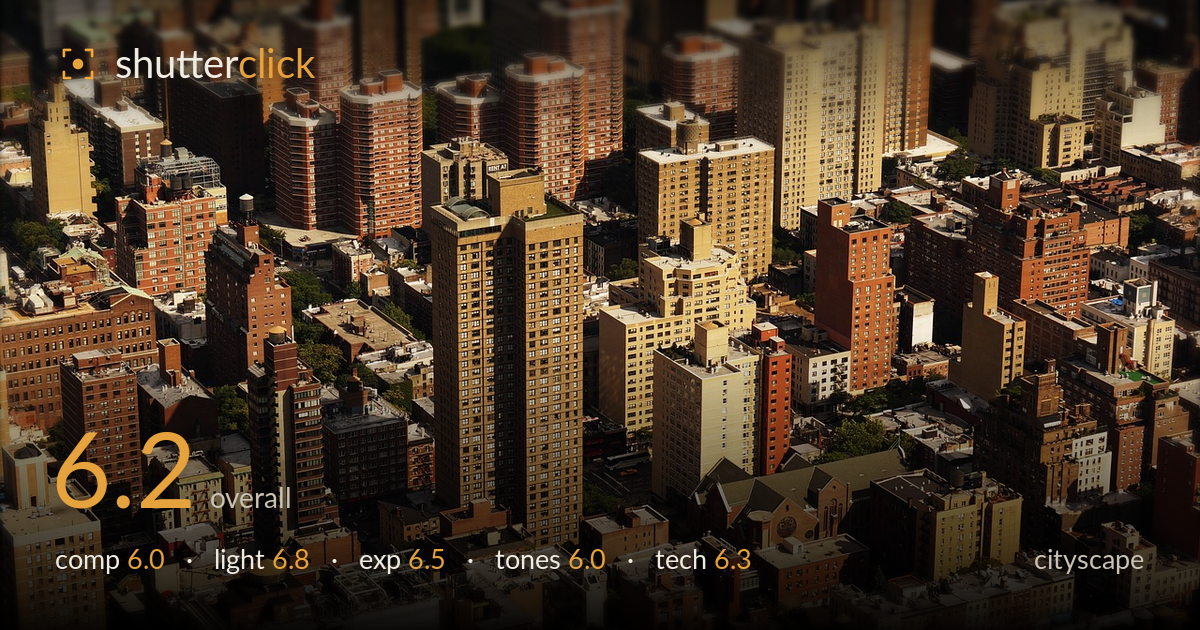
A dense, elevated view of a residential Manhattan grid, its warm brick towers packed edge to edge with genuine textural richness. The heavy tilt-shift blur and dark vignette are the defining choices, and both are overplayed — the miniature effect softens too much of the frame and the vignette closes the corners in a heavy-handed way. The image reads as an all-over texture rather than a composition with a clear anchor. A stronger lead subject and a lighter hand on the post-processing would let the real strength — the rhythm of the towers under raking afternoon light — carry the shot.
The frame is filled corner to corner with towers, giving a satisfying density and repeating vertical rhythm, but there's no clear anchor for the eye to settle on. The central pale tower steps forward slightly, yet competes with a dozen equally weighted neighbours. The aerial angle flattens the depth that a stepped, layered skyline could offer. Without a foreground-to-background progression or a dominant subject, the composition reads as an even carpet of buildings. A stronger diagonal or a single emphasised structure would give the busy grid a point of entry.
Warm, low afternoon sun rakes across the towers from the right, carving out the vertical faces and casting the shadowed sides into deep contrast — this directional light is the image's best asset, giving the brick genuine dimensionality. The rooftops catch highlight cleanly while the street canyons fall into shadow, reinforcing the sense of a dense, layered city. Timing near golden hour suits the warm palette. The only limitation is that the same light flattens toward the softened, blurred edges of the frame.
Exposure holds the warm brick midtones well and retains detail across most of the sunlit faces. Highlights on the pale rooftops sit near the top of the range but don't blow out badly. The added vignette artificially crushes the corner shadows, discarding detail that the sensor likely captured. Deep canyon shadows retain reasonable information given the contrast of the scene. Overall the exposure is competent, but the darkened edges are a post choice that costs shadow detail rather than an in-camera problem.
The palette leans heavily warm — reds, ochres and browns dominate, which suits the brick city but tips slightly orange, likely from added warmth in processing. Contrast is punchy, arguably too much, and combined with the vignette it gives a processed, slightly HDR-adjacent look. The mid-tones in the brick are rich, but the overall grade lacks tonal separation between the many similarly coloured buildings. A cooler, more neutral white balance would let individual structures read more distinctly against one another.
The dominant technical decision is a digital tilt-shift blur simulating a miniature, and it's applied too aggressively and too unevenly — the blur gradient doesn't follow a plausible focal plane, smearing the top and bottom bands while leaving a narrow central strip sharp. Where focus is retained, detail is good: window grids, water tanks and rooftop clutter resolve cleanly, suggesting a capable lens and a stable, well-lit capture with no visible motion blur or noise. The aerial vantage and long effective focal length compress the towers nicely. The issue is entirely in post: the fake depth-of-field draws attention to itself rather than guiding the eye, and the heavy vignette compounds the artificial feel. A subtler, correctly oriented blur — or none at all, letting the natural sharpness of the scene stand — would serve the image better. The underlying capture is technically sound; the processing overreaches.
What would elevate it
Tags
Shot something like this?
Expert photo critique, on demand — scored across six categories, EXIF-aware. Start with 3 free critiques, no credit card.
critique my photo — free