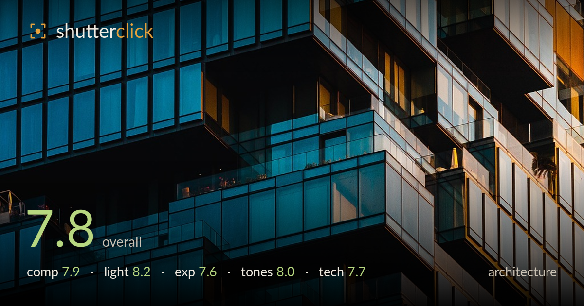
Warm and cool glass balconies
Photo by theanandthakur

No EXIF metadata in this file
Technical analysis based on visual assessment only.
A confident abstraction of a glass residential tower that trades context for pattern, and largely earns it. The staggered, cantilevered balconies create a jagged diagonal spine that splits cool blue reflections from warm gold-lit facade — the strongest thing in the frame. What most holds it back is the slightly arbitrary framing: the diagonal of balconies runs off both the left and top edges without a clear anchor, so the eye wanders rather than resolving. Verticals also lean a few degrees, undermining the rigid geometry the subject depends on. Sharpness and tonal separation are strong throughout.
The staggered balconies form a strong zig-zagging diagonal that cuts the frame into a cool blue left and a warm right — a genuine graphic idea. Filling the frame edge to edge with no sky suits the abstract, pattern-driven read. The weakness is that the diagonal enters and exits without a clear focal anchor, so the eye drifts across repetition rather than landing. A frame edge cutting the cantilevers more decisively, or a placement that lets one balcony dominate, would give the geometry a destination.
Low-angle late light is doing the heavy lifting here, raking across the facade to split cool shadowed glass from warm sunlit panels. That warm/cool division is the image's engine and it reads clearly. The grazing angle also picks out the depth of each recessed balcony, giving the stacked boxes real dimensionality rather than flat pattern. Some of the deepest balcony interiors fall to near-black, which is atmospheric but swallows detail. Slightly earlier or fuller light would retain more of that interior structure.
Exposure is judged to protect the bright gold panels on the right, which hold texture and colour without blowing out — the right call for this light. The trade-off is the shadowed balcony recesses on the left and centre, which block up to near-black and lose the internal detail visible elsewhere. The blue glass midtones sit well and carry the bulk of the frame. Lifting shadows modestly in post would recover balcony interiors without flattening the strong contrast that makes the split work.
The teal-versus-amber palette is the defining feature and it's handled with restraint — saturated enough to read as a deliberate colour story, not pushed into caricature. White balance splits believably between the cool reflected sky and the warm direct sun, and the transition zone through the centre glass reads naturally. Contrast is punchy and suits the graphic intent. The only caution is that the teal edges slightly cyan in the darker glass; a touch more tonal separation there would keep the blues from feeling uniform.
Focus is crisp across the facade, with the mullions and panel edges rendering sharply from near to far — consistent with a longer lens stopped down enough to hold the receding planes, which is the right approach for compressing this kind of repeating architecture. Detail holds well into the highlights and there's no visible noise in the shadow areas even where they run deep. The main technical shortfall is verticals: the window lines lean a few degrees, which matters more here than usual because the entire image rests on rigid geometry — even a small tilt reads as an error against a grid this strict. A perspective correction to true up the verticals would sharpen the whole composition. The compression from the long focal length is used well, flattening the balconies into an interlocking pattern, and the framing captures a satisfying repeat of the modular units. Overall execution is clean; the discipline just needs to extend to keystoning and level lines.
What would elevate it
Tags
Shot something like this?
Expert photo critique, on demand — scored across six categories, EXIF-aware. Start with 3 free critiques, no credit card.
critique my photo — free