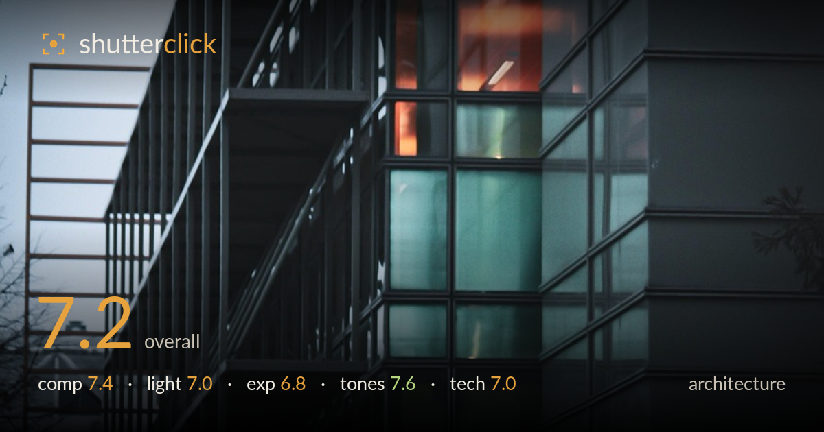
Warm glow behind glass at dusk
Photo by kierantrinel

No EXIF metadata in this file
Technical analysis based on visual assessment only.
A moody, well-observed study of a glass-and-steel facade, its strength being the warm interior glow set against cool teal glazing — a genuine colour tension that carries the frame. The receding balcony rail and grid of mullions build convincing depth and rhythm. What holds it back most is the flat blue-hour light, which leaves the near tower face murky and undifferentiated, and shadow areas that slide into near-black without recoverable detail. The composition leans heavily right; more breathing room or a stronger anchor on the left could balance the weight. The verticals hold reasonably well for a diagonal approach.
The oblique angle sends the facade grid receding into the frame, and the projecting balcony rail on the left creates a strong converging line with real depth. The warm-lit windows sit at natural focal points along the vertical stack, drawing the eye. Balance skews right, though — the dark tower face dominates while the left half thins into sky and bare branches. A touch more foreground or a firmer left anchor would steady the weight. The near-symmetry of the mullion grid is a genuine asset here.
Blue-hour ambient light does the mood work, letting the interior tungsten glow read as warm punctuation against cool glass. That colour contrast is the image's engine. But the exterior illumination is flat and directionless, so the steel structure and the right-hand tower face lack modelling — surfaces read as tonal masses rather than textured planes. A few minutes earlier, with more directional sky light, would have separated the framework from its background and revealed the material of the facade rather than flattening it into silhouette.
The exposure protects the warm window highlights well — the orange interiors hold colour and detail without blowing out, which is the right priority. The trade-off is heavy shadow, with the tower face and lower structure collapsing toward pure black and little recoverable information there. The sky is clean and free of clipping. Overall it reads as a deliberate low-key choice suited to the hour, though lifting the darkest quarter slightly in post would restore some structural read without dulling the mood.
The teal-and-orange palette is the standout — cool glazing playing against warm tungsten is handled with restraint rather than pushed to cliché. White balance sits convincingly in blue hour, the sky graduating cleanly. Contrast is strong and the mood cohesive. The shadows run a little muddy in places, more dark grey-blue than clean black, which slightly flattens the deepest tones. A subtle lift in shadow separation and a hair more midtone contrast in the steelwork would give the tonal range more of a backbone.
Focus lands accurately on the mullion grid and the mid-frame windows, and the overall frame holds acceptable sharpness across the facade, suggesting an aperture chosen sensibly for depth. Noise is controlled given the low light, with no obvious smearing in the shadow regions — a sign the ISO stayed reasonable or the capture was well supported. The vertical lines are close to true, indicating either careful levelling or restrained correction, which matters for architecture; the slight lean is consistent with the oblique vantage rather than sloppy handling. What limits the technical read is the shadow region, where detail simply isn't there to resolve — a bracketed exposure or a longer single frame on a tripod would have carried more structural information in the near tower. The lens rendering is clean with no distracting distortion at the frame edges. Solid, controlled execution overall; the ceiling here is set by capture decisions around dynamic range rather than by any focus or sharpness failing.
What would elevate it
Tags
Shot something like this?
Expert photo critique, on demand — scored across six categories, EXIF-aware. Start with 3 free critiques, no credit card.
critique my photo — free