Warm light across glass facets
Photo by wal_172619

No EXIF metadata in this file
Technical analysis based on visual assessment only.
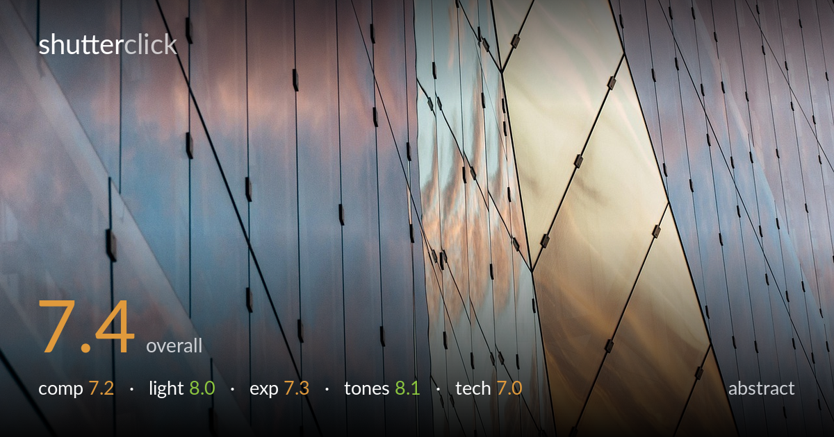
A confident abstract built on a faceted glass facade, where the warm sunset glow pooling into the right-side panels carries the whole frame. The interplay of cool blues and that golden core gives the image genuine emotional pull and a strong diagonal rhythm. What most holds it back is structural ambiguity: the two distinct grid systems — vertical panels left, diamond facets right — compete rather than fully resolve into one reading. The fade to softness on the upper left also drains tension from that corner. Tighten the relationship between those zones and the graphic impact sharpens considerably.
The diagonal sweep of mullions and the diamond-faceted right side create real visual rhythm, and the warm panel acts as a natural focal anchor pulling the eye across the frame. The two grid systems meeting near centre is the strongest gesture here. Less resolved is the left third, where the vertical panels feel comparatively inert and the softening toward the top-left corner saps energy. A composition that pushed the diamond geometry more dominant, or balanced the two systems more deliberately, would read with greater intent rather than as a found fragment.
Golden-hour light reflected across the glass is the image's greatest asset — the warm amber pooling into the lower-right panels against the cool blue-violet of the rest sets up a satisfying temperature contrast. The graduated reflection of clouds and sky animates otherwise flat surfaces, giving each panel its own subtle luminosity. The light reads as soft and directional, wrapping the facets convincingly. The only limitation is that the warmth is confined to one quadrant; a moment with the glow spread further would have balanced the frame's energy.
Exposure is well controlled across a tricky reflective surface. The bright warm panels hold their gradation without blowing out, and the cooler blue zones retain detail in the cloud reflections. Shadows in the mullion lines stay clean and readable. The brightest amber sections approach but don't lose their highlight roll-off, which speaks to careful metering. The darker lower-right corner edges toward muddiness, and a touch more midtone separation there would help, but overall the dynamic range of the scene is handled with restraint.
The colour story is the highlight: cool periwinkle and steel blues set against that warm sodium-amber core, a complementary pairing that gives the abstract its emotional charge. White balance feels true to the golden-hour reflection without tipping garish. Saturation is judged with restraint, letting the gradations within each panel breathe rather than crushing them into blocks. Tonal transitions across the reflected clouds are smooth and painterly. If anything, the left side's tones sit slightly flat next to the vivid right, a small imbalance worth addressing in grading.
Sharpness is strongest through the centre and right, where the panel edges and mounting clips render crisply, suggesting accurate focus on the dominant plane. The softening toward the upper-left corner reads as falloff — whether from depth of field at an oblique angle to the facade or slight optical softness at the frame edge — and it weakens that region's contribution. For an abstract relying on graphic precision, edge-to-edge crispness would serve the geometry better. Noise is well controlled and the surfaces stay clean, with no visible compression artefacts in the smooth tonal gradients. The framing crops the facade into a pure pattern, a sound choice that removes context and forces attention onto form and light. Stopping down further, or shooting more parallel to the surface, would have brought the entire grid into equal sharpness and strengthened the abstract reading. As executed, the technical foundation is solid where it counts most — on the warm focal panels.
what would elevate it
tags
Shot something like this?
Expert photo critique, on demand — scored across six categories, EXIF-aware. Start with 3 free critiques, no credit card.
critique my photo — free