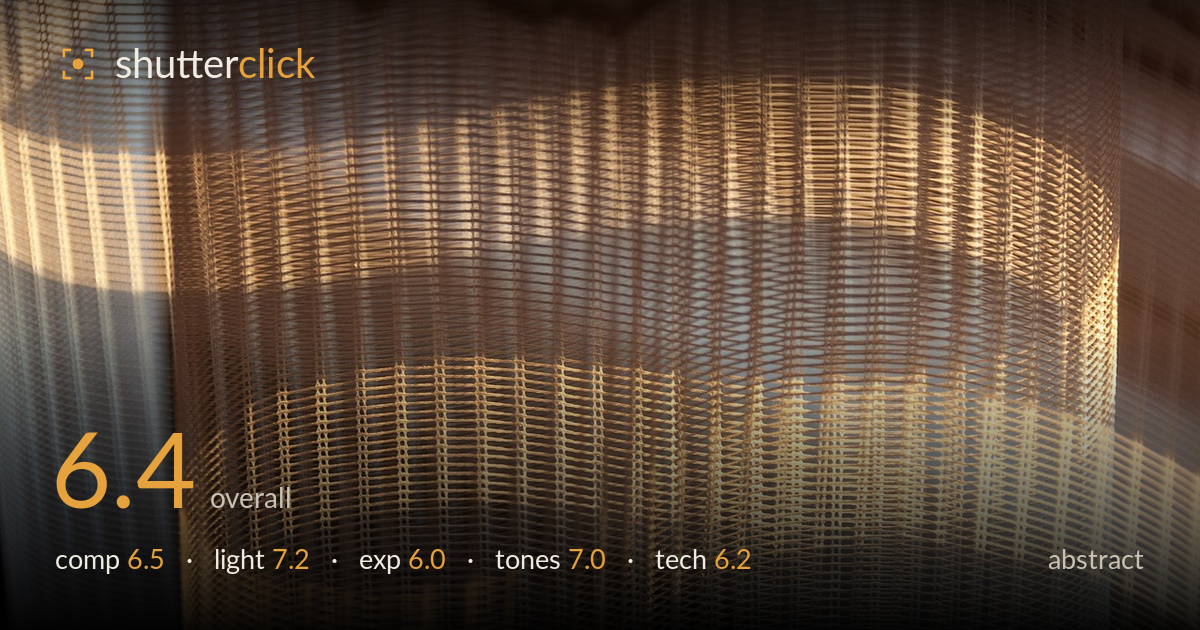
Warm light through a woven curtain
Photo by wal_172619

No EXIF metadata in this file
Technical analysis based on visual assessment only.
Warm light raking across a sheer woven curtain produces a quiet, textural abstract with genuine graphic appeal — the grid of threads catching light against soft folds carries real rhythm. What most holds it back is the flat, evenly-lit central mass: the frame reads as a single band of texture without a clear focal anchor or tonal counterpoint to pull the eye through. The blown highlights along the lower-right also erode detail where the weave is most interesting. There's a strong idea here; it needs stronger internal structure and tighter highlight control to become a resolved image rather than a pleasant fragment.
The horizontal banding of light against the vertical thread structure sets up a satisfying grid, and the soft curve of the folded fabric on the right adds welcome variation. But the frame lacks a clear focal anchor — the eye wanders across an even field of texture without landing anywhere. The brightest, most detailed weave sits low and right, leaving the upper third comparatively dead. A composition built around one dominant fold, or a diagonal emphasis, would give the abstract the internal tension it currently misses.
This is the image's strongest element. Low, warm directional light rakes across the weave and picks out individual threads, revealing the material's structure beautifully — exactly the kind of grazing light that makes texture sing. The golden cast suggests low sun through glass, and it lends warmth and mood. The gradient from shadowed left to lit right gives the flat plane some dimension. The one caution is that the light peaks too hard in places, tipping into pure white and flattening the very detail it should reveal.
The exposure leans bright, and the highlights along the lower-right weave and the central band clip to paper white, losing the thread detail that is the whole point of the shot. Shadows on the left retain reasonable information, so dynamic range isn't badly compressed, but the decision to expose for the folds has sacrificed the texture in the brightest zones. Pulling exposure down by a third to two-thirds of a stop would recover that lost weave and hold the warm glow without blowing through it.
The warm amber palette is coherent and suits the intimate, late-light mood, with a pleasing gradient from cool shadowed grey-blue on the left to golden warmth on the right. The white balance reads intentional rather than accidental. Mid-tone gradation across the folds is smooth. The limitation is a slightly muddy quality in the mid-warm tones where highlight and midtone blur together near the clipped areas; a touch more separation between the lit and shadowed weave would give the tones more crispness and depth.
Focus appears accurate on the picture plane where it matters, and the weave is rendered sharply enough across most of the frame to carry the abstract intent — the individual threads resolve cleanly through the lit central band. Depth of field looks adequate for a flat, near-parallel subject, with no distracting focus falloff. Noise is not an issue at this brightness. The principal technical shortfall is highlight management: the brightest regions are clipped, and while some of that is the subject's own reflectivity, a lower exposure or a polarising filter to tame the sheen would have preserved more. Framing the fabric slightly off-parallel, or including a hint of the window edge or a fold's leading curve, would have added the spatial cue this flat capture lacks. The execution is competent and the subject well-observed; the main gains lie in exposing more conservatively and choosing a viewpoint that gives the weave a stronger three-dimensional read.
What would elevate it
Tags
Shot something like this?
Expert photo critique, on demand — scored across six categories, EXIF-aware. Start with 3 free critiques, no credit card.
critique my photo — free