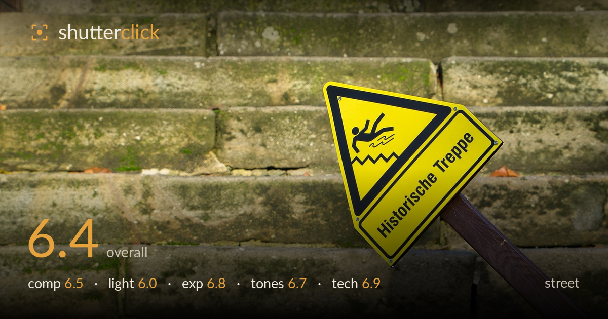
Warning sign on the old steps
Photo by scansven

No EXIF metadata in this file
Technical analysis based on visual assessment only.
A tidy visual joke — a 'slippery steps' warning sign angled across the very weathered stone staircase it warns about — carries this frame, and the concept lands cleanly. The yellow sign pops against muted grey-green stone and the 'Historische Treppe' text reads well. What holds it back is that the idea is stated rather than developed: without a person in the frame slipping, hesitating, or ignoring the sign, it stays a documented object rather than a moment. The tilted post cuts into the lower right somewhat awkwardly, and the flat side light does little to model the stone. Sharp, competent, and mildly witty — one human element short of memorable.
The staircase fills the frame with a strong horizontal rhythm of receding steps, and placing the sign at the lower-right intersection breaks the repetition effectively. The diagonal post adds welcome tension against all those horizontals. However, the sign sits slightly cramped against the right edge, and the post's exit point feels arbitrary rather than anchored. The vast expanse of empty steps upper-left is fine as texture but reads as unused space rather than purposeful negative space. A touch more breathing room to the right of the sign would settle the balance.
Soft, slightly warm side light rakes across the stone from the left, which does help pick out some of the lichen and pitting on the treads. But the overall quality is flat and undirected — the shadows are weak and the modelling on the deeply textured stone stays muted when this surface begs for stronger, lower raking light. The yellow sign catches enough light to stay vivid. Shooting nearer golden hour, with harder low-angle light skimming the steps, would carve out the age and wear far more dramatically.
Exposure is well controlled. The bright yellow sign holds its saturation without clipping, and the black pictogram and lettering retain clean edges. Shadow detail in the recessed step joints and beneath the sign is preserved, and the midtone grey of the stone sits at a comfortable, readable level. No blown highlights of concern across the frame. The histogram would sit balanced with a slight lean toward the midtones, which suits the muted subject. A deliberate, safe exposure with no real faults.
The muted grey-green stone against the punchy yellow sign is a pleasing, restrained palette, and the warm brown post adds a third quiet note. White balance leans slightly warm, which flatters the scene. Contrast is moderate and appropriate — nothing feels crushed or washed. The lichen greens and orange leaf fragments give small tonal accents that reward a second look. A modest boost in local contrast on the stone would give the texture more presence without disturbing the overall harmony. Tonally the image is well judged.
Focus is placed accurately on the sign, which is crisp across its face, with the text and pictogram rendered sharply. Depth of field is handled sensibly: the near steps and sign sit in focus while the upper steps fall softly out — a gentle gradient that suggests a moderately open aperture and keeps attention where it belongs. Noise is not an issue; the image looks clean at the pixel level with good detail retention in the stone. The rendering of the metal sign's slight sheen and the grain of the wooden post both read well. The main technical limitation is not one of execution but of shutter opportunity — as a still object study it's competent, but a street frame gains far more from freezing a passing gesture or reaction near the sign. Nothing in the capture is technically deficient; the craft is sound and repeatable. The chief unrealized gain would come from a lower angle to exaggerate the recession of the steps.
What would elevate it
Tags
Shot something like this?
Expert photo critique, on demand — scored across six categories, EXIF-aware. Start with 3 free critiques, no credit card.
critique my photo — free