Warsaw skyline old and new
Photo by Surprising_Media

No EXIF metadata in this file
Technical analysis based on visual assessment only.
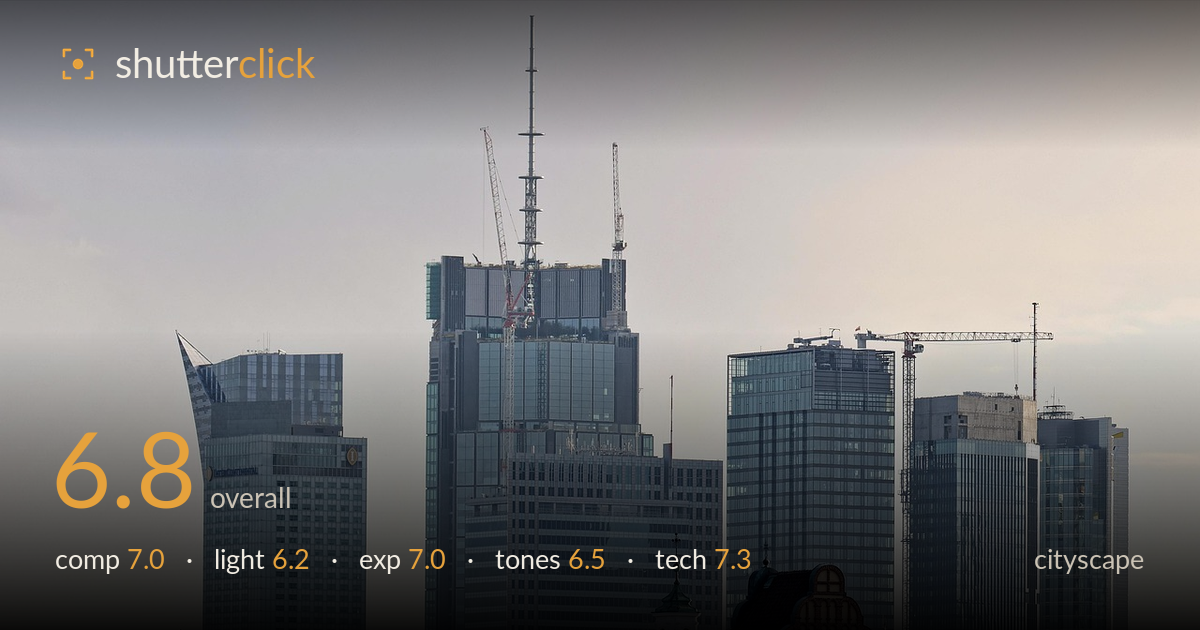
The juxtaposition of old and new — a copper church dome and brick tower set against gleaming glass skyscrapers — gives this Warsaw skyline a strong thematic core, and the compression from a long lens stacks the layers cleanly. What most holds it back is the flat, hazy light: the sky is a featureless pale gradient and the buildings lack the modelling that low-angle side light would bring. The composition leans heavily right, leaving the left third comparatively empty, and the crop cuts historic elements awkwardly along the bottom edge. Solid documentation of the cityscape that stops short of atmospheric drama.
The layered stack of towers reads well and the old-versus-new tension between the copper dome, brick tower, and glass high-rises is the picture's real strength. Weight sits noticeably to the right, though, leaving the left third — with only the InterContinental and a small spire — feeling comparatively empty. The tallest tower with its crane-topped spire anchors the centre effectively. The bottom edge clips the church and foreground buildings in a slightly untidy way, and a touch more foreground breathing room would settle the historic elements more comfortably.
Light is the weakest link here. A hazy, diffuse late-afternoon sky flattens the scene, giving the glass facades little directional modelling and washing the sky to a near-featureless pale gradient. There's a faint warmth catching the right-side towers that hints at low sun, but it never resolves into the raking side light that would carve texture into the facades and separate the layers. Shooting closer to golden hour, or on a clearer day with harder cross-light, would give the towers dimension and the sky more presence.
Exposure is handled sensibly for a high-key, hazy scene. Highlights in the pale sky are held rather than blown, and shadow detail in the darker church tower and foreground trees is retained without muddiness. The midtones sit a little low-contrast, a byproduct of the atmospheric haze rather than an exposure fault. Nothing clips destructively. The overall reading is safe and even, which suits documentation, though a slightly more assertive tonal placement in post would give the facades more punch without sacrificing the retained highlights.
The palette is cool and muted — grey-blue glass against a desaturated pale sky — broken only by the green copper dome and warm brick tower, which are the most engaging tonal notes in the frame. White balance leans neutral-to-slightly-warm, appropriate for the hour. Contrast is soft, again a haze effect, leaving the image reading a touch grey overall. A gentle contrast lift and a nudge of clarity in the buildings would restore separation between the stacked planes without pushing the delicate sky into an unnatural gradient.
The long-lens compression is used to good effect, stacking the towers and collapsing the distance between historic and modern architecture into a tight, layered plane. Focus is accurate across the building faces, and detail holds up well — the crane lattices, spire filigree, and window grids all render crisply, suggesting a sharp lens stopped down enough for adequate depth across the flat subject plane. Noise is not a concern in this bright scene. Verticals are largely upright with only minor convergence, acceptable for a telephoto skyline where perspective distortion is naturally minimal. The main technical limitation is atmospheric rather than optical: distant haze softens micro-contrast in the farthest towers, which no aperture choice would fully overcome. A polarising filter might have cut some of that veiling haze and deepened the sky slightly. Overall the execution is clean and competent, delivering a sharp, well-resolved frame that captures the skyline's density with control.
What would elevate it
Tags
Shot something like this?
Expert photo critique, on demand — scored across six categories, EXIF-aware. Start with 3 free critiques, no credit card.
critique my photo — free