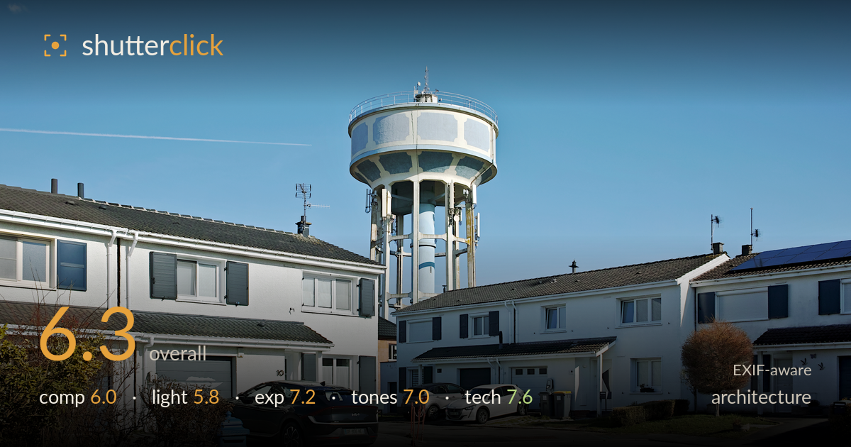
Water tower over a quiet cul-de-sac
Photo by Velvet

| Focal length | 19 mm |
| Aperture | f / 7.1 |
| Shutter | 1/400 s |
| ISO | ISO 100 |
| Exp. comp. | 0.0 EV |
| Shot at | 11:16 · Feb 27, 2024 |
The water tower makes a strong central anchor, but the frame reads as a documentary record of a suburban cul-de-sac rather than a composed architectural study. The tower rises cleanly against a deep blue sky and the detail rendering from the Foveon sensor is genuinely crisp. What holds it back is the flat midday light that leaves the white housing blocks and the tower's concrete without shaping shadow, and a busy foreground of parked cars, bins and a road that competes for attention. Tighter framing on the tower or a stronger foreground element would give the image more purpose.
The water tower dominates the upper centre and provides a clear focal point, framed by two rows of white houses that create a loose channel toward it. The problem is the foreground: parked cars, a wheelie bin, hedges and the sweep of tarmac all pull the eye in different directions with no clear path to the tower. The tower sits slightly left of centre, which is fine, but the wide angle keeps everything at similar scale so nothing reads as a deliberate hierarchy. A lower angle or tighter crop would sharpen the intent.
Flat, high overhead midday sun does the architecture few favours. The white facades and the tower's concrete panels receive even frontal light that flattens their form and leaves little shadow to describe surface or depth. The roofs and undersides carry the only real shadow, and it reads as incidental rather than sculpting. For architecture, raking side light from earlier or later in the day would model the tower's cylindrical volume and the panelled banding far more convincingly. The clear sky is clean but the timing gives the structures no dimensionality.
Exposure is well judged for a bright, high-contrast scene. The white house facades hold detail without blowing out, and the deep blue sky retains saturation and tone. Shadow areas under the eaves and around the tower's legs keep enough information to read structure. The histogram appears to sit comfortably across the range with no significant clipping in either direction. At ISO 100 there is clean tonal separation throughout. Nothing here reads as accidental — the brightness placement is deliberate and holds the demanding contrast well.
The Foveon rendering gives crisp, slightly cool colour that suits the subject. The blue sky is rich without turning artificial, and the whites of the buildings stay neutral rather than drifting warm or cyan. Contrast is on the higher side, which the midday light already exaggerates, pushing the white walls close to stark. Some of the shadowed roof tiles and the tower's grey panels sit a touch flat in the mid-tones. Overall the white balance is accurate and the palette coherent, if a little clinical for the suburban mood.
The settings are well matched to the scene. At f/7.1 the depth of field is deep enough to hold both the foreground cars and the distant tower acceptably sharp, appropriate for an architectural wide shot. The 19mm lens on the dp1 Quattro delivers the fine per-pixel detail the Foveon sensor is known for — the tower's railings, antennae and panel seams resolve cleanly. ISO 100 keeps noise absent and preserves tonal smoothness in the sky. 1/400s is more than fast enough for a static subject handheld, leaving no motion concern. Focus is accurate across the plane. The one technical weakness is perspective: the wide lens introduces mild converging verticals on the houses at frame edges, and the buildings lean slightly. For strict architectural work this would benefit from correction in post or a more level, considered camera position. Otherwise the execution is clean and the gear is used to its strengths, with the sensor's detail advantage clearly visible throughout.
What would elevate it
Tags
Shot something like this?
Expert photo critique, on demand — scored across six categories, EXIF-aware. Start with 3 free critiques, no credit card.
critique my photo — free