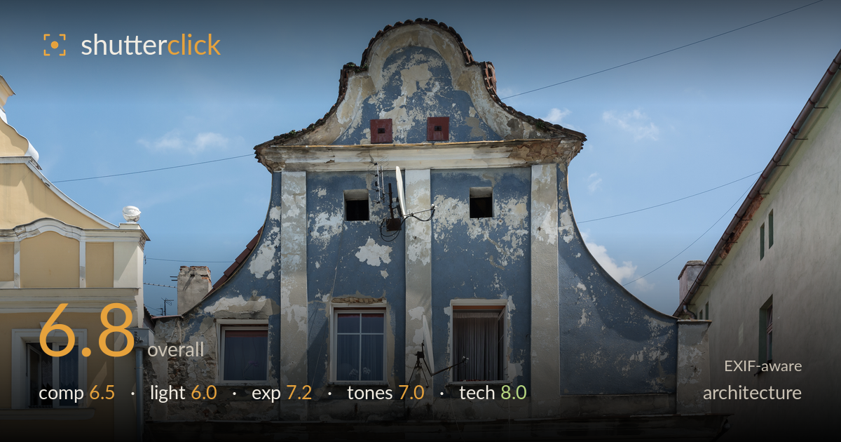
Weathered baroque gable in blue
Photo by Jacek Halicki

| Focal length | 27 mm |
| Aperture | f / 9.0 |
| Shutter | 1/320 s |
| ISO | ISO 200 |
| Exp. comp. | 0.0 EV |
| Shot at | 13:10 · Jun 14, 2015 |
A well-documented facade study whose weathered blue baroque gable is the clear draw — the peeling render and ornate curved parapet carry genuine character. The frontal, corrected perspective serves the architectural record well, and detail across the wall is crisp. What holds it back most is the light: flat, high midday sun leaves the gable's sculptural relief underserved and the sky rather empty. The neighbouring buildings crowd the edges without adding much, and the composition sits slightly weighted right. As a straightforward documentary record it succeeds; as an image it would gain from stronger, raking light and a cleaner edge treatment.
The central gable is placed with a documentarian's instinct for symmetry, and the curved baroque parapet reads clearly against open sky. Framing the two flanking buildings adds context but also clutter — the yellow facade on the left and green block on the right compete at the edges without contributing structure. The subject sits marginally right of centre, and the tight top crop nearly clips the roof tiles. More sky headroom would give the ornate gable room to breathe, and a slightly tighter frame on the blue facade alone would sharpen the statement.
Hard, near-overhead midday sun flattens the facade's most interesting feature — the sculptural relief of the gable and its mouldings — leaving them without the shadow modelling that would reveal texture and depth. The peeling render still shows some tonal variation, but the light is doing little work to shape it. The sky is a clean blue with a few clouds, pleasant but static. Raking side light from early morning or late afternoon would rake across the render and cast the cornices into relief, giving the aged surface far more dimension.
Exposure is well judged for a bright, high-contrast scene. Highlights on the pale render and white window frames hold detail without clipping, and the shadowed recesses beneath the cornice retain information. The blue sky is rendered at a natural density rather than blown. Midtones across the weathered wall are placed to preserve the mottled texture that gives the subject its interest. There is little to fault here — the histogram appears full without crushing shadows or losing the brightest whites, and the choices read as deliberate.
The muted blue-grey of the aged render against warm yellow and green neighbours makes for a restrained, believable palette, and white balance looks accurate under direct sun. Contrast is a touch flat, a consequence of the overhead light rather than the grade, which leaves the blue facade slightly lifeless. The sky's gradation is clean. A modest contrast lift and a small clarity boost on the render would let the peeling texture and colour variation register with more presence without pushing into artificiality.
The settings are well matched to the task. At f/9 the whole facade sits within depth of field, appropriate for a frontal architectural record where front-to-back sharpness matters, and 27mm on the 18-70 keeps perspective distortion modest while still fitting the building. Verticals are close to true, suggesting careful camera alignment or subsequent correction — important for this genre and handled well. 1/320s at ISO 200 is comfortably fast for a static handheld subject, and ISO 200 keeps noise negligible with clean shadow detail. Focus is accurate across the plane, and fine detail — the roof tiles, the satellite-dish mounts, the crest on the right building — resolves crisply. The only reservation is that f/9 is near the lens's sharpest range but slightly past optimal for a modest wide; nothing visible suffers for it. Overall this is technically sound, disciplined work: the right aperture, adequate shutter, base-quality ISO, and attention to the geometry that this subject demands.
What would elevate it
Tags
Shot something like this?
Expert photo critique, on demand — scored across six categories, EXIF-aware. Start with 3 free critiques, no credit card.
critique my photo — free