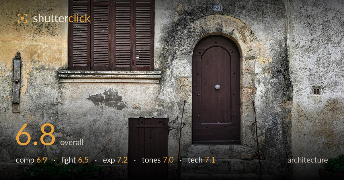
Weathered doorway at number 29
Photo by lecreusois

No EXIF metadata in this file
Technical analysis based on visual assessment only.
A characterful weathered facade with a strong central subject in the arched doorway, but the frame carries too much competing detail to fully resolve. The number-29 door anchors the shot well, and the flower planters add welcome colour against the muted stone. What holds it back is the busy foreground — the black bollards intruding along the bottom edge feel accidental rather than framing, and the wall texture, though appealing, spreads attention thin. A cleaner separation of subject from clutter and stricter attention to verticals would lift this from a pleasant travel record to a deliberate architectural study.
The arched doorway sits slightly right of centre, giving the frame a natural anchor, and the shuttered window plus twin planters build a lived-in symmetry. But the black bollards cropped along the bottom edge read as intrusions rather than deliberate framing, and the right-hand planter is clipped awkwardly. The wide inclusion of textured wall is atmospheric yet dilutes focus. Tightening around the doorway, steps and left planter — and either fully including or excluding the bollards — would give the composition clearer intent and stronger balance.
Flat, overcast light renders the scene evenly and avoids blown highlights, which suits the documentary honesty of the aged plaster. It does, however, mute the depth of the arched recess and the relief of the crumbling render — surfaces that would reward directional light. The doorway's shadowed interior stays legible without drama, and the shaded consistency keeps colour balanced. Raking side light in late afternoon would carve out the wall texture and the stone step edges far more sculpturally.
Exposure is well judged for a high-detail, textured subject. Highlights on the pale stone stay controlled without clipping, and the darker door timber and shadowed archway retain visible grain and structure. The midtones sit comfortably, giving the render and cobbles ample tonal separation. Nothing appears crushed or washed out — the flat light helps the dynamic range fit cleanly. A touch more shadow lift inside the doorway recess would recover the faint detail there, but overall this is a technically sound, balanced exposure.
The palette leans into earthy ochres, greys and the deep brown of the woodwork, an honest reading of the weathered facade. White balance is neutral and believable under the overcast sky. Contrast is nudged up — likely HDR-style processing — which enriches the stone texture but flattens some of the wall's tonal subtlety and gives edges a faintly gritty look. The flower colours provide a needed lift. Slightly gentler local contrast would keep the character while easing the processed, over-textured feel.
Focus is accurate across the frame with generous depth of field, keeping the near planters and the far door equally crisp — appropriate for a facade study where every surface matters. Sharpness is high throughout, and there is no visible motion blur or intrusive noise, suggesting a stable, well-supported capture. The lens choice renders the scene with only mild perspective distortion, though the verticals show a slight lean and the wall geometry is not perfectly squared to the sensor, which a shift lens or careful post-correction would resolve. The clarity and micro-contrast enhancement, probably from HDR merging or heavy local-contrast processing, is the main execution concern: it exaggerates the stone grain to the point of looking slightly artificial. Dialling that back would let the genuine texture speak for itself. Overall the technical execution is competent and clean — good focus, good depth, controlled exposure — with room to refine perspective accuracy and the intensity of post-processing.
What would elevate it
Tags
Shot something like this?
Expert photo critique, on demand — scored across six categories, EXIF-aware. Start with 3 free critiques, no credit card.
critique my photo — free