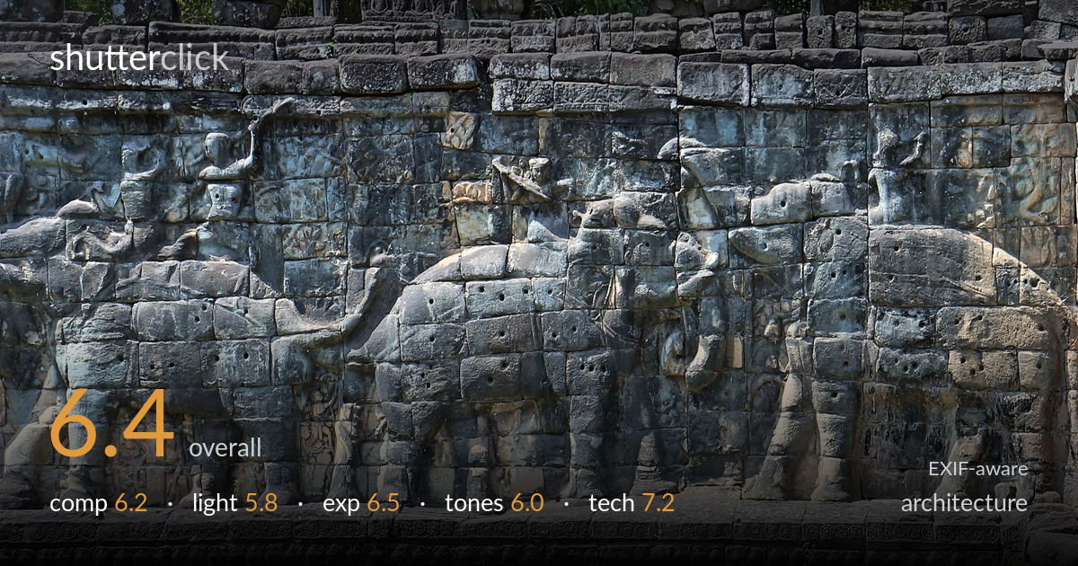
Weathered elephant relief wall
Photo by Pierre André Leclercq

| Focal length | 32 mm |
| Aperture | f / 8.0 |
| Shutter | 1/250 s |
| ISO | ISO 200 |
| Exp. comp. | 0.0 EV |
| Shot at | 05:36 · Jan 29, 2014 |
A documentary-grade record of the Terrace of the Elephants bas-relief that prioritises legibility over interpretation. The frontal, full-frame fill keeps the carving readable and the f/8 aperture holds sharpness across the weathered stone, which is the right instinct for this kind of subject. What most holds it back is light: flat, slightly hazy daylight that suppresses the relief depth these carvings depend on, leaving the elephants reading as texture rather than form. The framing is also clipped on every edge, denying the wall any structural context. A raking light and a touch more breathing room would lift this from inventory shot to evocative.
The frontal, parallel approach keeps the relief panel readable and avoids keystoning, which suits documentary intent. But the frame is cropped tight on all four edges — top, bottom, and both sides cut through the structure arbitrarily, so the wall has no clear beginning or end and reads as a fragment rather than a composition. The central elephant anchors the eye, yet the repetition of forms is left flat rather than used as deliberate rhythm. A small margin of context — sky, base, or terminating edge — would give the geometry a frame to sit within.
Flat, diffuse midday light is the core limitation here. Bas-relief carving lives or dies by the shadows that define its depth, and this even illumination renders the elephants as shallow texture instead of dimensional form. The trunks, tusks, and riders that should leap forward instead blend into the stone. There is no directional modelling to separate foreground carving from background wall. Early or late raking side light, skimming across the relief, would carve out the volumes and reveal the craftsmanship that the flat light currently flattens.
Exposure is competently handled for tricky conditions. The bright stone retains highlight detail without clipping, and the recessed carving holds shadow information, so the full tonal span of the weathered sandstone survives. The 0.0 EV decision at f/8 was sound for the even light. A few of the upper bleached blocks edge toward the bright end, but nothing blows out. The overall placement sits a touch flat — protecting detail at the cost of punch — which is defensible for a record image but leaves the midtones lacking separation.
The grey-green sandstone palette is rendered faithfully, with the lichen and moss staining reading naturally against the warmer ochre patches lower in the frame. White balance is neutral and believable. The limitation is contrast: the tonal range is compressed into a narrow band of greys, giving the image a muted, slightly muddy feel that compounds the flat lighting. The green foliage along the top adds an unwanted cool cast that competes with the stone. A modest contrast and clarity lift would help the relief read more crisply.
The settings are well chosen for the subject. f/8 on the NEX-F3's APS-C sensor sits in the lens's sharp range and delivers front-to-back depth of field across a wall photographed near-parallel, so the entire relief plane stays acceptably sharp — exactly what this flat subject needs. ISO 200 keeps noise negligible and preserves fine detail in the pitted stone. 1/250 s is more shutter than a static wall requires but does no harm and guarantees no shake at 32 mm. Focus appears accurately placed on the carving plane. The 32 mm focal length (roughly 48 mm equivalent) gives a natural, distortion-light perspective that keeps the verticals honest. The only technical shortfall is not in the capture chain but in framing discipline — a step back or a slight reposition would have included the wall's edges without changing any of these otherwise solid exposure and focus decisions. Solid, unshowy execution that serves the documentary goal.
What would elevate it
Tags
Shot something like this?
Expert photo critique, on demand — scored across six categories, EXIF-aware. Start with 3 free critiques, no credit card.
critique my photo — free