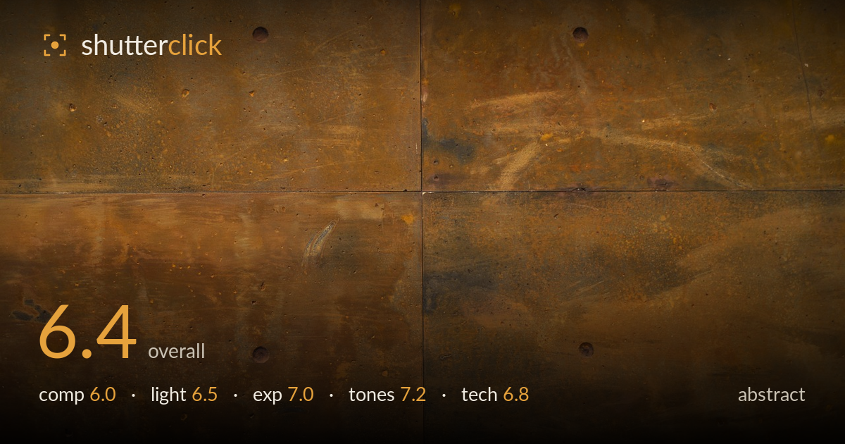
Weathered metal wall in four panels
Photo by Engin_Akyurt

No EXIF metadata in this file
Technical analysis based on visual assessment only.
A patinated metal wall of four bolted panels, read as texture and colour field. The strength is the surface itself — the mottled rust-and-brass patina, the subtle mineral bloom, the tonal shifts from warm ochre to cool grey-green. What holds it back is the composition: the panel seams form a near-centred cross that divides the frame into four almost-equal quadrants, a static symmetry that feels accidental rather than considered. The bolt heads punctuate but don't build rhythm. The material carries real graphic interest; a more deliberate framing decision — either committing to symmetry or breaking it — would give the surface a stronger reason to be the whole picture.
Four panels meet in a cross that sits just off-centre, splitting the frame into four near-equal blocks. This division is the weakest structural choice — it neither commits to clean symmetry nor offsets the seam for tension, so it reads as an unresolved middle ground. The bolt heads are the only punctuation, but their placement doesn't establish a rhythm across the quadrants. The texture itself carries the frame. Filling with a single panel, or letting the seam cut on a strong diagonal, would give the surface more graphic purpose.
Soft, even light rakes gently from the upper area, catching the faint brush-marks and mineral streaks without harsh specular glare — appropriate for showing surface texture. A slightly more raking, directional light would deepen the relief of the bolt heads and the subtle undulation of the metal, giving the patina more three-dimensional presence. As shot, the flat, diffuse quality keeps the detail readable but a touch inert, so the surface reads as colour and stain rather than as a tactile, worked object.
Well controlled. The mid-tones sit comfortably where the patina lives, and nothing important clips — the darker corners retain detail and the brighter ochre passages hold texture without blowing. The histogram would sit in a tidy central mass, which suits a subject this even in value. There's no dramatic dynamic range to manage here, and the restraint is right for the material. A marginally deeper black point in post would add a little snap without losing the mineral subtlety in the shadow blooms.
The palette is the strongest asset — warm ochre and rust playing against cooler grey-green oxidation, with white balance sitting in a believable, earthy register. The tonal range is narrow but purposeful, giving a unified, aged-metal mood. Saturation is judged well; the colour feels natural rather than pushed. The subtle transitions between the warm and cool stains reward close looking. A touch more contrast separation between the ochre and green zones could heighten the abstract interplay without tipping into artificiality.
Focus and resolution are handled well — the surface texture, the pitting, the fine brush-stroke marks and the raised bolt heads all render with adequate crispness across the frame, suggesting a well-chosen aperture for a flat, parallel subject. There's no visible motion blur and noise appears controlled in the darker zones, so the capture is clean. The plane of the wall sits parallel to the sensor, keeping the whole surface acceptably sharp corner to corner, which is exactly what a texture study requires. The one execution note is that framing appears to be the main variable left uncontrolled: the seams could have been aligned more deliberately to the frame edges, and a slight rotation would square the horizontal seam. For an abstract surface study the technical foundation is sound; sharpness serves the texture, and the even rendering lets the material speak. Refinement lies in framing discipline rather than in optics or exposure execution.
What would elevate it
Tags
Shot something like this?
Expert photo critique, on demand — scored across six categories, EXIF-aware. Start with 3 free critiques, no credit card.
critique my photo — free