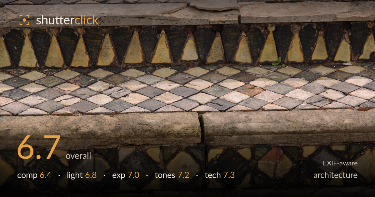
Weathered mosaic steps in detail
Photo by mattbuck (category)

| Focal length | 93 mm |
| Aperture | f / 5.6 |
| Shutter | 1/160 s |
| ISO | ISO 100 |
| Exp. comp. | 0.0 EV |
| Shot at | 10:09 · Jul 9, 2011 |
A study of aged, weathered mosaic steps that succeeds most as a texture and pattern document. The layered horizontal bands — diamond tiling, the triangular sawtooth border, worn stone nosings, and the diamond-in-square frieze — build a genuine sense of stratified detail and history. What holds it back is the flat, overhead framing that reads more as a record shot than a composition: the horizontal bands stack without a clear entry point for the eye, and the frame is cropped so the steps feel like fragments rather than a resolved whole. Strong material interest, undercut by a framing choice that doesn't fully shape it.
The stacked horizontal bands give the frame a strong stratified rhythm, and the alternating pattern types — diamonds, the triangular sawtooth, the diamond-in-square frieze — hold interest across the whole surface. The problem is a lack of a clear anchor or entry point; the eye wanders the bands without settling. The near-frontal, slightly top-down angle flattens the steps into stripes and loses the sense of depth that a lower, raking viewpoint would restore. The edges cut the patterns arbitrarily, so the composition reads as a crop of something larger.
Soft, shadowless overcast light suits this subject well — it renders the glazed tiles evenly and avoids blown highlights on the shiny surfaces, letting the colours read across the whole frame. The trade-off is a lack of modelling: without directional light, the raised stone nosings and the depth between step treads sit flat, and the surface texture of the worn tiles is under-revealed. A lower, raking side light would carve out relief in the crumbling grout and stone edges, adding a dimensionality this even illumination flattens.
Exposure is well controlled for a tricky mixed-material surface. Highlights on the pale stone nosings hold detail without clipping, and the dark green and near-black glazed tiles retain shape and separation rather than crushing to black. Midtones sit comfortably, giving the full tonal spread of the diamond field room to breathe. The overcast light made this easier, but the choices are sound — nothing important is lost at either end. If anything, a touch more shadow lift in the darkest tile bands would recover a little more of the glaze colour.
The muted, earthy palette — olive greens, ochres, terracotta, and weathered grey — is the image's real strength, and the colours feel authentic to the aged, moss-touched material. White balance is neutral and believable under the flat light, and the tonal range spans deep tile shadows to pale stone without feeling forced. Contrast is gentle, which fits the subdued subject. The greens and yellows in the frieze bands carry the most life; the diamond field is a touch flat by comparison, and could take a modest local contrast lift to separate the tiles.
The 93mm focal length on the K-x compresses the stepped bands into flat parallel stripes, which contributes to the record-shot flatness — a wider lens from a lower angle would have restored depth and let verticals converge more naturally. That said, execution at these settings is clean. f/5.6 gives enough depth of field to hold the near and far bands acceptably sharp across the tilted surface, though the far top edge softens slightly, and a stop or two down would have secured front-to-back sharpness on a plane this oblique. ISO 100 keeps the file clean with no visible noise, and 1/160s is more than adequate for a static subject. Focus lands on the central tile bands where it matters. The tile detail and grout texture are well resolved, showing the lens and sensor handled the fine repeating pattern without smearing. Solid, unfussy technical work — the limiting factor is the framing and viewpoint, not the execution.
What would elevate it
Tags
Shot something like this?
Expert photo critique, on demand — scored across six categories, EXIF-aware. Start with 3 free critiques, no credit card.
critique my photo — free