Weathered plaster in warm tones
Photo by PellissierJP

No EXIF metadata in this file
Technical analysis based on visual assessment only.
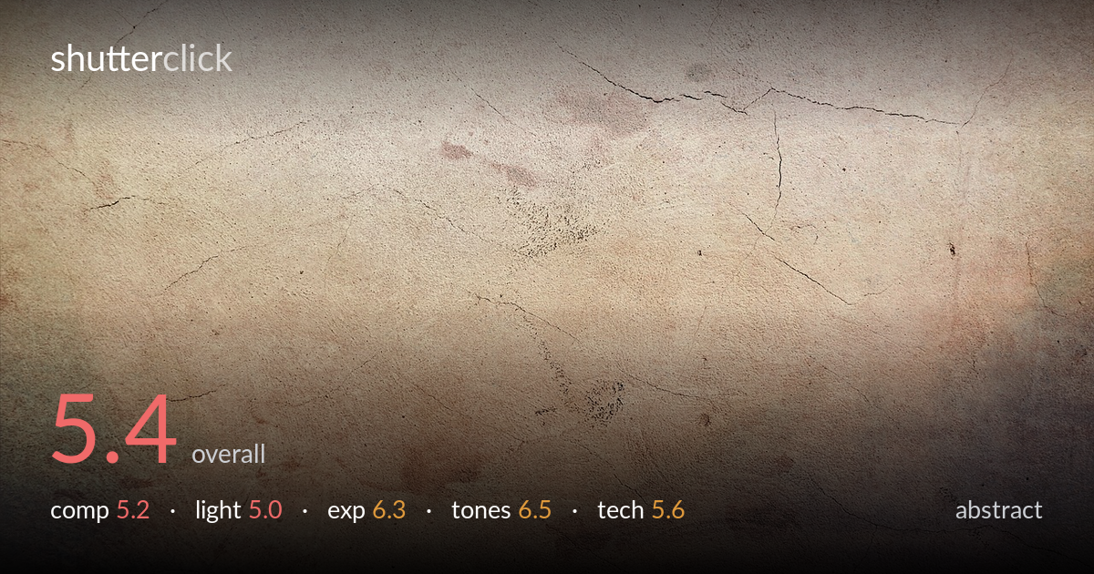
This is a flat-lit texture study of a cracked, weathered plaster wall — pleasant as a surface but lacking the graphic intent that lifts abstract work from raw texture. The earthy warmth shifting into cooler mauves at the lower corners is the most compelling element, giving a subtle diagonal tonal flow across the frame. What holds it back is the absence of a dominant form or anchor: the crack lines wander without resolving into structure, and the even, frontal light flattens the relief that could have carried the image. A heavy vignette and uniform softness read more as a stock texture than a composed photograph.
The frame reads as an even field with no clear anchor — the hairline cracks meander across the upper third but never resolve into a leading structure the eye can follow. The most interesting passage is the warm-to-cool tonal shift bleeding from the lower-left and lower-right corners, which creates a faint diagonal pull. As abstract work, graphic intent matters more than a subject, and here the distribution is too uniform to build rhythm or tension. Letting one crack or stain dominate would give the composition a spine.
The light is flat and frontal, which suppresses the very relief that makes weathered plaster interesting. Cracks, pitting, and surface undulation all need raking light to read as texture, and here they sit nearly shadowless. The result is a surface described by colour rather than by form. There is no directional shaping, no shadow play to give the wall dimension. A low, grazing side light skimming across the plane would carve out the cracks and pockmarks, turning a flat record into something sculptural.
Exposure is safe and well controlled — highlights in the pale central plaster hold detail without clipping, and the darker corners retain information rather than blocking up. The histogram sits comfortably in the upper-mid range, suiting the airy, faded mood. The applied vignette darkens the edges deliberately, which is a stylistic rather than exposure issue. Overall brightness reads as intentional and the dynamic range is used sensibly across a low-contrast subject, with no accidental crushing or washout to correct.
Tones are the strongest element. The warm sandy beige of the upper field drifting into dusty rose and cool mauve at the lower corners gives a quiet, aged palette with genuine appeal. The grading feels deliberate — a vintage, sun-faded character that suits weathered plaster. Saturation is restrained and the transitions are smooth. The main caution is that the colour is doing nearly all the work; without tonal contrast or form, the palette alone has to carry the frame, and it can only do so much.
Judged on visual evidence alone, the capture appears reasonably sharp across the plane but lacks crisp micro-detail — the surface reads slightly soft, whether from the lens, processing, or an applied texture overlay. For a flat subject like a wall, depth of field is a non-issue and there is no motion to manage, so the technical demands are modest and largely met. The heavy edge vignette and the somewhat hazy, low-clarity rendering suggest aggressive post-processing that has smoothed away the fine grit and pitting that would give plaster its tactile bite. Noise is not a concern. The frame is level and evenly framed. For an abstract texture, the priority would be resolving the finest surface detail at the key plane and lighting it to reveal relief — sharpness alone is not enough when the light flattens everything. Pulling back on the global softening and vignette in post would recover some of the crispness the subject needs to feel like a deliberate study rather than a stock backdrop.
what would elevate it
tags
Shot something like this?
Expert photo critique, on demand — scored across six categories, EXIF-aware. Start with 3 free critiques, no credit card.
critique my photo — free