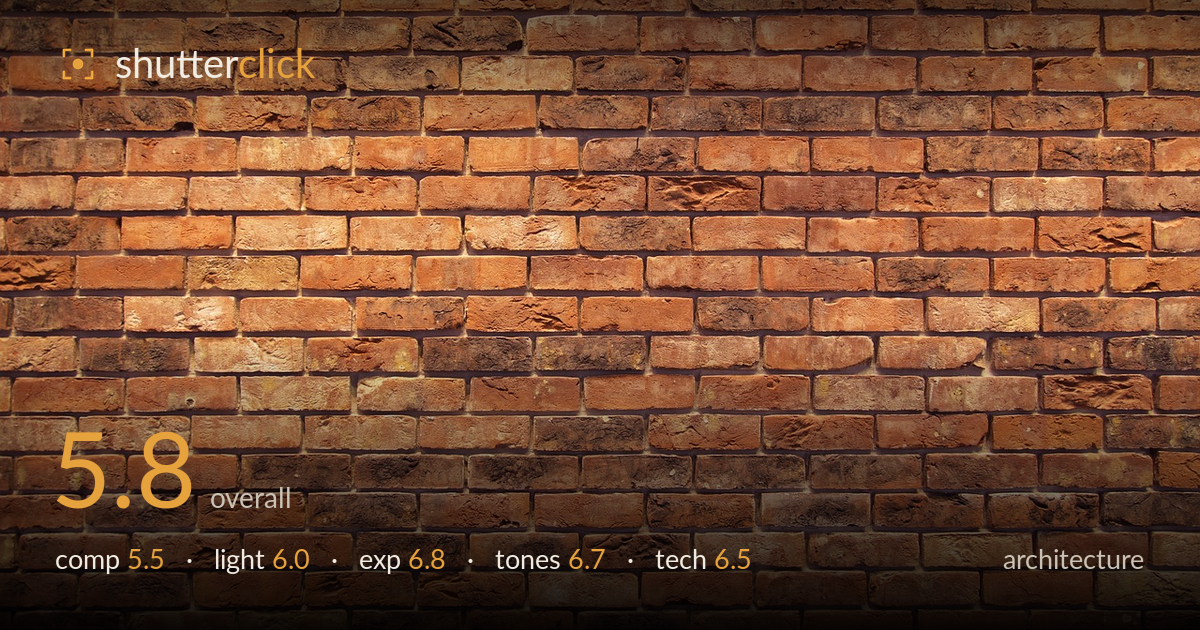
Weathered red brick wall
Photo by Michael_Laut

No EXIF metadata in this file
Technical analysis based on visual assessment only.
A flat, frontal study of a weathered brick wall — competent as a texture reference but lacking a compositional idea to lift it above stock material. The frame is filled edge to edge with the running-bond pattern, which reads as honest documentation rather than a considered architectural statement. What most holds it back is the absence of any anchor: no focal brick, no shift in light, no edge or corner to give the pattern context or scale. The colour and texture rendering is the strongest asset here. A raking side light or an off-axis vantage would turn repetition into rhythm.
The wall fills the frame in a flat, parallel-to-sensor view, which keeps verticals and horizontals clean but offers no focal point or entry. The running-bond pattern repeats evenly with no variation to hold the eye — no corner, edge, or contrasting element to establish scale or context. As pure texture it is serviceable, but as an architectural image it lacks an organizing idea. An angled vantage revealing depth, or including an edge where the wall meets something else, would give the pattern somewhere to lead.
The light appears to come from the upper left, low enough to graze the surface and pull out some of the pitting and irregularity in the brick faces — the best thing the lighting does here. It is fairly diffuse overall, so the raking effect is gentle rather than dramatic, and the texture stays somewhat muted in the flatter areas. A harder, lower side light would carve the surface relief far more emphatically and turn the wall's irregularity into genuine visual interest.
Exposure is well controlled across the frame. Highlights on the lighter bricks hold detail without clipping, and the darker, sootier bricks retain texture rather than blocking into black. The even frontal subject makes metering straightforward, and the histogram sits comfortably in the mid-to-upper range with no reckless choices. There is a slight overall brightness that flattens some of the surface contrast — pulling exposure down a touch would deepen the mortar lines and add snap to the texture.
The warm terracotta and rust palette is the image's strongest quality — rich, varied, and true to weathered brick, with a pleasing range from ochre through deep burnt sienna to near-black sooting. White balance sits warm, which suits the subject. Contrast is moderate; the mortar lines could carry more separation from the brick faces. Saturation looks natural rather than pushed. A modest contrast lift and slight clarity boost would let the tonal variation between individual bricks register more distinctly.
From visual evidence the image is sharp corner to corner, indicating a suitably stopped-down aperture and a lens with even field performance — appropriate for a flat, planar subject where uniform focus matters. The plane of focus sits parallel to the wall, so depth of field is a non-issue and detail holds consistently across the frame. No motion blur or visible camera shake, and noise is well suppressed, suggesting a low ISO and stable support or adequate light. Verticals and horizontals read true with no obvious keystoning, which speaks to a squared-up, perpendicular shooting position — the correct discipline for architectural texture. The execution is technically clean; what it lacks is a technical decision that serves an idea, such as a wider lens to include context or a shift toward a raking angle to exploit surface relief. The craft is sound but conservative, applied to a subject that offers little for the technique to distinguish itself against.
What would elevate it
Tags
Shot something like this?
Expert photo critique, on demand — scored across six categories, EXIF-aware. Start with 3 free critiques, no credit card.
critique my photo — free