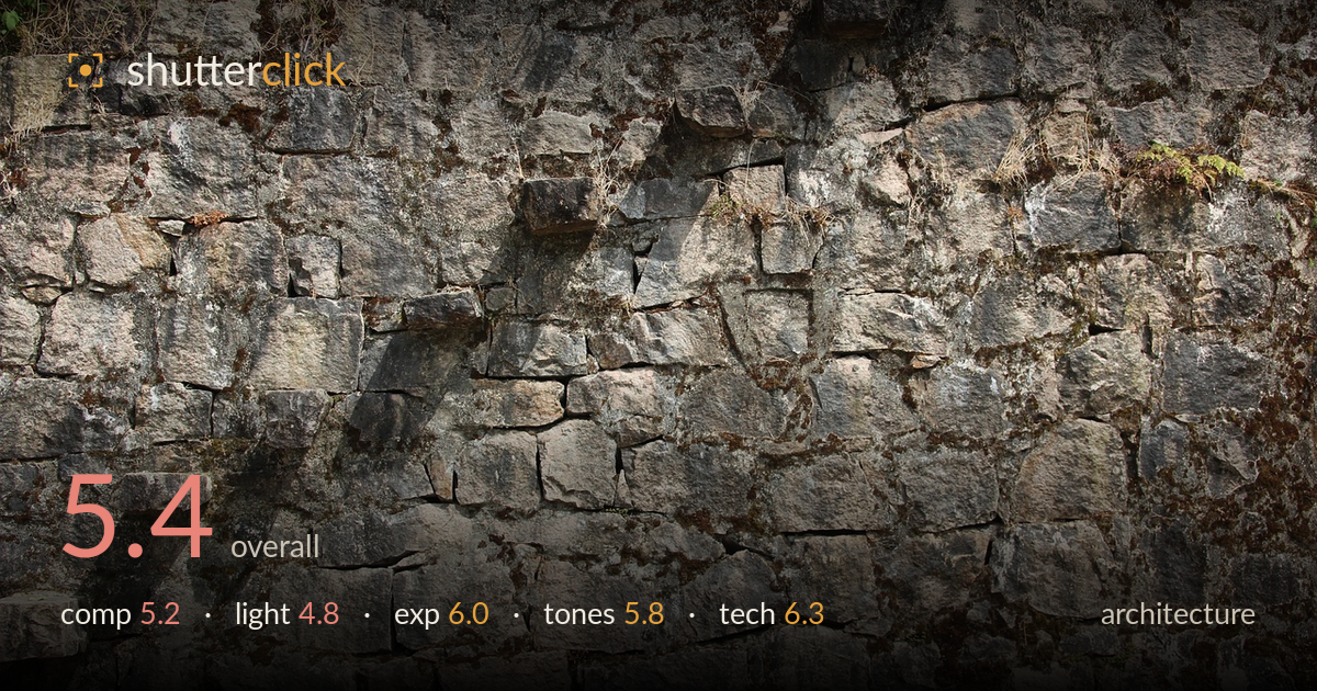
Weathered stone wall in sunlight
Photo by Peggy_Marco

No EXIF metadata in this file
Technical analysis based on visual assessment only.
This reads more as a texture study than an architectural statement, and that ambiguity is what most holds it back. As a flat, frame-filling capture of a dry-stone or rubble-masonry wall, it documents the surface competently but lacks a compositional anchor — no dominant stone, no leading structure, no edge or corner to define the wall as a built object. The diagonal shadow cutting across the upper left introduces the strongest visual interest but feels accidental rather than composed around. The exposure holds detail reasonably well, and the stonework texture is sharp. It needs a clearer intent: either a purer, evenly-lit texture or a stronger architectural context.
The frame is filled edge to edge with masonry, which suits a texture study but leaves the eye without a resting point or hierarchy. No single stone or feature dominates, so the gaze wanders without settling. The diagonal shadow band across the upper-left quadrant is the only real compositional line and it is not deliberately placed. The sliver of vegetation top-left hints at a boundary but is cropped awkwardly. A recognisable edge, corner, or repeating course would give the wall structure and turn pattern into architecture.
Direct, hard sunlight rakes across the wall, and while raking light can reveal stone texture beautifully, here it lands unevenly — the harsh diagonal shadow across the top left creates a distracting dark wedge rather than modelling the surface consistently. The right and lower portions sit in flatter, more open light that renders texture better. The mixed lighting fights the uniformity a texture shot wants, yet isn't dramatic enough to feel intentional. Softer, more even light, or a lower raking angle across the whole face, would serve the stone.
Exposure is handled reasonably for a high-contrast subject in direct sun. Highlights on the pale stones hold detail without significant clipping, and the shadowed recesses between blocks retain some information rather than blocking to pure black. The midtones carry the grey stonework well. The bright shadow-lit areas and the darker crevices span a wide range, and the balance struck keeps most of that range usable. A touch of shadow lift would recover the deepest gaps, but nothing here reads as an exposure error.
The palette is a muted range of warm greys, buff browns, and the ochre of dry grass and moss — accurate and natural for weathered stone. White balance sits neutral to slightly warm, which suits the sunlit subject. Contrast is fairly high from the direct light, giving the stones definition but also emphasising the uneven shadow. The green moss accents and dry vegetation add subtle colour variety. Tonal gradation across the stone faces is decent; a slight contrast pull-back would soften the harsher transitions.
From visual evidence, focus is sharp across the frame and the fine texture of the stone — grain, moss, mortar gaps — is well resolved, suggesting a moderate aperture that kept the largely flat plane in focus front to back. There is no visible motion blur and noise appears well controlled, pointing to a low ISO in good daylight. The flatness of the subject works in the image's favour technically, since depth of field is not challenged by a single plane. Sharpness holds into the corners without obvious softness or heavy distortion, so lens choice appears adequate for the task. The main technical limitation is not execution but framing intent: the capture is clean but the camera was positioned square to a featureless section without a defining edge or converging line to test perspective control. For architecture, more attention to squareness relative to a corner or course, and to how light strikes the plane, would raise the result beyond a competent surface record.
What would elevate it
Tags
Shot something like this?
Expert photo critique, on demand — scored across six categories, EXIF-aware. Start with 3 free critiques, no credit card.
critique my photo — free