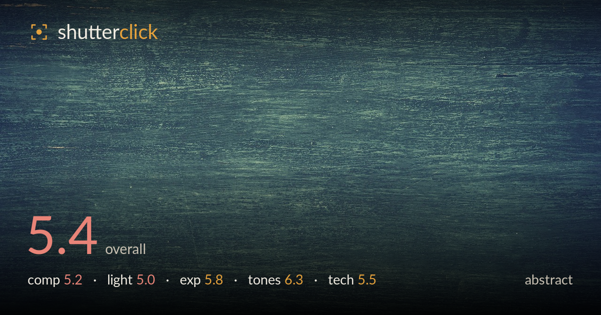
Weathered teal wood grain
Photo by Pexels

No EXIF metadata in this file
Technical analysis based on visual assessment only.
This reads as a texture study of weathered, teal-painted wood — a competent surface capture that leans more toward a stock backdrop than a resolved abstract image. The horizontal grain gives a consistent rhythm, and the desaturated teal-green palette carries a cohesive, muted mood. What holds it back is the lack of a focal anchor or compositional tension: the frame is uniform edge to edge, so the eye has nowhere to travel and nothing to resolve on. The heavy vignette and even wash flatten what could be dramatic raking texture. As pattern it works; as a standalone abstract statement it needs a point of emphasis.
The horizontal grain establishes a steady directional rhythm across the whole frame, which is the strongest structural element here. But the surface is treated as wall-to-wall texture with no variation in scale, density, or emphasis, so there is no anchor to hold the eye. The small worn patch in the top-left corner is the only break in uniformity and it sits awkwardly at the edge rather than being used deliberately. For abstract work, a shift in framing that plays that one irregularity against the flat field would create the tension the composition currently lacks.
The light is flat and even, which renders the grain legibly but suppresses the depth this kind of textured surface can offer. Weathered wood comes alive under low, raking light that throws each ridge and gouge into relief; here the illumination sits close to frontal, so the scratches read as tonal marks rather than physical texture. The pronounced darkening toward the edges appears to be an added vignette rather than natural falloff, and it does more to flatten the center than to shape it. Directional light would transform the surface.
Exposure is controlled and sits in a safe mid-to-low range with no clipped highlights and shadows that retain detail even in the darker corners. The overall placement is deliberate, keeping the muted palette intact without muddying it. The one concern is the vignette, which pulls the edges down enough to lose some of the subtle grain information there. A slightly brighter global exposure, or lifting the corners, would let more of the surface texture breathe while keeping the moody, low-key character that suits the subject.
The teal-green grading is the most successful aspect — cohesive, atmospheric, and restrained, with a cool cast that gives the plain surface real character. The muted saturation and gentle contrast avoid the flat greyness that often plagues texture shots. Mid-tone gradation across the grain is smooth, and the color stays consistent without odd hue shifts. If anything, a touch more separation between the greens and the darker blues would add depth. As it stands, the palette is the clearest sign of an intentional creative hand at work here.
From visual evidence the capture is technically sound for a texture study: focus appears even across the plane, suggesting the surface was shot close to parallel to the sensor, which keeps the grain sharp corner to corner. There is no obvious motion blur and noise is well controlled in the shadow areas. Detail rendering on the scratches and grain is crisp enough to convey the surface without over-sharpening artifacts. The lens choice and framing capture a flat field cleanly, which is exactly what this subject requires. The main technical limitation is not execution but interpretation — the flat frontal lighting means the technique serves documentation of the surface rather than revealing its dimensional texture. Getting the sensor plane precisely parallel and closing the aperture enough to hold every ridge in focus is done well; the missing piece is using light and a shallower or more selective focus to create a plane of emphasis that would give the technically clean capture a reason to be looked at as an image rather than a swatch.
What would elevate it
Tags
Shot something like this?
Expert photo critique, on demand — scored across six categories, EXIF-aware. Start with 3 free critiques, no credit card.
critique my photo — free