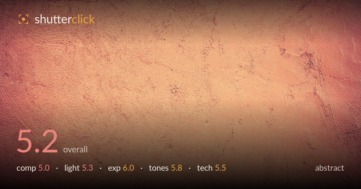
Weathered terracotta plaster wall
Photo by Pexels

No EXIF metadata in this file
Technical analysis based on visual assessment only.
This is a flat frontal texture study of a weathered plaster wall — competent as raw material but underdeveloped as an image. The warm terracotta tone and fine surface grain give it a pleasant, usable quality, and the exposure holds detail across most of the frame. What holds it back is the lack of a compositional anchor: the surface reads evenly across the whole frame with no dominant feature, gradient, or line to lead the eye. The heavy applied vignette feels like an afterthought rather than an integral choice. As texture, it works; as a standalone abstract, it needs a stronger organising element.
The frame is filled edge to edge with uniform wall surface, which is honest for a texture but leaves the eye wandering without a resting point. The faint diagonal cracks in the upper-left and lower-right hint at structure but are too subtle to anchor the composition. An abstract still benefits from a dominant form, rhythm, or gradient — here the surface reads as consistent noise rather than deliberate pattern. Framing tighter on the more active cracked areas, or emphasising the tonal shift across the surface, would give the eye somewhere to go.
The light is soft and frontal, which flattens the plaster's relief and suppresses the very texture that makes such a wall interesting. There is a gentle brightening toward the centre, but it appears to come from the applied vignette rather than raking light. Raking side light — low and grazing across the surface — would throw the cracks, pits, and trowel marks into shaded relief and reveal genuine three-dimensional texture. As shot, the surface reads as colour and stain more than tactile form, which limits its abstract impact.
Exposure is well controlled. Highlights in the brighter central plaster hold detail without clipping, and the darker edges retain information rather than crushing to black. The midtones sit comfortably and the surface stains and fine cracks remain legible throughout. The dynamic range of the subject is modest, so there is little risk here, but the brightness is judged sensibly. The main caveat is that the darkening at the corners is a post vignette rather than a lighting or exposure decision, which slightly undermines how deliberate the tonal falloff feels.
The warm terracotta-to-peach palette is the strongest asset — cohesive, inviting, and consistent across the frame. White balance leans deliberately warm, which suits the material. However, the heavy vignette pushes the corners toward a muddy, desaturated brown that fights the cleaner warmth of the centre, and the overall grade feels slightly faded, as though a preset lifted the blacks. A more even tonal treatment, or a vignette that respects the colour rather than dulling it, would let the warmth breathe more convincingly.
Focus and sharpness appear adequate across the plane, with the fine grain of the plaster resolved reasonably well in the central region, softening slightly toward the edges. Without EXIF, judging from visual evidence: the depth of field is sufficient for a flat, parallel subject, and there is no visible motion blur, so shutter and aperture were handled competently for this kind of static work. Noise is low. The most obvious technical intervention is the applied vignette, which is fairly aggressive and unevenly weighted — it draws attention to itself rather than integrating. There is also a mild loss of micro-contrast in the surface detail, whether from the light or from processing, that flattens the texture. For a texture or abstract of this kind, a slightly more oblique camera angle, or dedicated raking light, would recover the surface relief that flat capture and heavy post have smoothed away. The core capture is clean; the finishing choices are what let it down.
What would elevate it
Tags
Shot something like this?
Expert photo critique, on demand — scored across six categories, EXIF-aware. Start with 3 free critiques, no credit card.
critique my photo — free