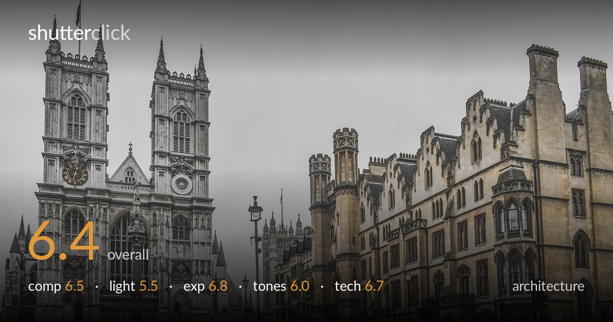
Westminster abbey on a grey day
Photo by dimitrisvetsikas1969

No EXIF metadata in this file
Technical analysis based on visual assessment only.
A competent record of Westminster Abbey that captures the Gothic detail cleanly, anchored by the well-placed yellow umbrella that breaks an otherwise grey street scene. The flat overcast light is the main limiter — it renders the stone without modelling and leaves the sky a featureless white block occupying the top third. Verticals lean slightly, the towers tipping inward, which matters in architecture. The frame also splits attention between the abbey on the left and the warmer building block on the right without committing to either. A clearer hierarchy and corrected perspective would lift this from a solid travel snapshot toward something more deliberate.
The two towers anchor the left third well and the diagonal of the right-hand building draws the eye inward, while the yellow umbrella provides a much-needed focal accent low in the frame. But the composition is split between two competing subjects with no clear hierarchy, and the wide expanse of blank sky eats the top third without earning it. The crowd of pedestrians along the base is busy and unresolved. A tighter crop favouring the abbey, or a lower angle emphasising the architecture, would give the frame a stronger spine.
Flat, diffuse overcast light dominates, and it does the architecture few favours. The soft, shadowless illumination flattens the deep relief of the Gothic carving and tracery, robbing the towers of the dimensionality that raking light would reveal. The white sky offers no directional cue and no warmth. While even light avoids blown highlights on pale stone, it leaves the whole scene low in contrast and atmosphere. Late-afternoon side light, or a moodier sky with texture, would shape these surfaces far more compellingly.
Exposure is handled reasonably given the difficult bright sky against shadowed stone. Detail holds in the abbey's facade and the darker right-hand building retains shadow information without crushing. The sky is near-white but only marginally clipped, an acceptable trade for the foreground. Midtones sit a touch flat, partly a consequence of the light rather than the exposure itself. The overall brightness reads deliberate and balanced, with no significant accidental under- or overexposure. A graduated approach to the sky would have offered more latitude.
The palette splits between the cool grey abbey and the warm sandstone block on the right, a contrast that works but feels slightly over-processed, with a faintly gritty HDR-like edge to the stone. The yellow umbrella is the strongest colour note and earns its place. White balance leans neutral-to-cool, fitting the overcast mood, though the overall result is muted and the grey sky drains vibrancy. Pulling back the local contrast and letting the tones breathe would yield a cleaner, more natural rendering.
Sharpness is good across the frame, with the abbey's tracery, pinnacles and clock faces holding crisp detail, suggesting a well-chosen aperture and a focal length that captures the breadth of the scene. Depth of field is deep and appropriate for architecture, keeping both near pedestrians and distant towers acceptably sharp. The main technical issue is perspective: the verticals converge noticeably, the towers leaning inward, which a tilt-shift lens or careful post-correction would resolve. There is also a slightly crunchy, over-sharpened texture to the stonework that hints at heavy clarity or HDR processing, introducing a faint halo along some roof edges against the sky. Noise is controlled and the image looks to have been shot at a sensible low ISO given the daylight. No motion blur is evident despite the moving crowd. Dialling back the sharpening and correcting the converging verticals would clean up the execution considerably and give the architecture the upright stability it needs.
what would elevate it
tags
Shot something like this?
Expert photo critique, on demand — scored across six categories, EXIF-aware. Start with 3 free critiques, no credit card.
critique my photo — free