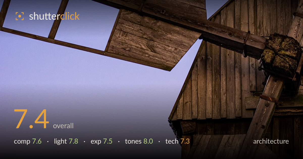
Windmill sail against a twilight sky
Photo by 5921373

No EXIF metadata in this file
Technical analysis based on visual assessment only.
A confident, graphic study of a wooden windmill against a twilight gradient, and the sky is the star — a clean lilac-to-pink wash that the dark timber cuts into decisively. The diagonal thrust of the sail across the top-left and the mass of the mill body on the right build a strong tension, with the empty sky giving the structure room to breathe. What holds it back is a slightly ambiguous focal centre: the frame reads as texture and shape rather than a single resolved subject. Tightening the geometry and committing to one anchor would lift this from handsome to memorable.
The diagonal sail slicing across the upper frame is the strongest gesture here, and the generous negative space in the sky is well used — it lets the timber mass assert itself. The sail lattice and the mill body form a satisfying dark counterweight against light. Less resolved is the crop on the right, where the structure runs off-frame without a clear reason, and the eye wanders between sail, roofline, and ladder without a single anchor. Committing to one dominant line would sharpen the read.
Twilight light does the heavy lifting: soft, directionless ambient glow renders the weathered wood without harsh shadow, and the cool blue-to-magenta sky supplies a natural gradient no filter could better. The timber picks up just enough warmth to separate from the cool background. The trade-off is that flat dusk light leaves the wood grain reading a little muddy on the shadowed faces — a touch of raking side light earlier in the evening would have carved more dimension into those planks.
Exposure is judged well for the conditions. The sky gradient holds smoothly with no visible banding or clipping in the brightest pink, and the wood retains detail across most of its faces. The darkest recesses near the mill body sit close to black but avoid crushing entirely. Balancing bright sky against dark timber at dusk is a real challenge, and this handles it with restraint. A slight lift in the deepest shadows would recover a touch more grain texture without flattening the mood.
The tonal work is the highlight. The blue-to-magenta-to-pink sky gradient is beautifully clean and clearly deliberate, and the muted, desaturated brown of the aged timber sits against it without fighting. White balance holds the cool sky and warm wood in convincing separation. Contrast is controlled — the dark structure reads graphically without going murky. If anything, the wood could carry a hint more warmth to strengthen the complementary play against the cool sky, but the restraint here is a strength, not a flaw.
From visual evidence, focus sits accurately on the timber, with the wood grain, joinery, and the mossy detail near the sail hub all crisply resolved — depth of field appears deep enough to hold the whole structure sharp, appropriate for the subject. Noise is well controlled in the sky gradient, which is where dusk shots often reveal chroma mottling; here it stays smooth. The lens choice frames the diagonal thrust effectively, though the perspective introduces mild converging lines in the mill body that read as lean rather than intentional geometry — for architecture, keeping verticals true or committing fully to a dynamic tilt reads more decisively than the in-between. Sharpness across the frame is consistent and the exposure decisions look deliberate rather than lucky. The main technical opportunity is perspective control: a slightly different shooting position or a correction pass would resolve whether the structure is meant to loom or stand upright, which currently reads as neither.
What would elevate it
Tags
Shot something like this?
Expert photo critique, on demand — scored across six categories, EXIF-aware. Start with 3 free critiques, no credit card.
critique my photo — free