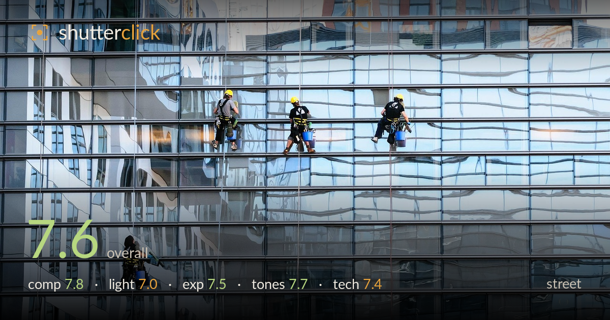
Window cleaners on a glass tower
Photo by bogitw

No EXIF metadata in this file
Technical analysis based on visual assessment only.
A strong graphic concept: four window cleaners suspended across a rippling glass facade, human scale set against the abstract distortion of a mirrored curtain wall. The staggered placement of the figures gives the frame rhythm and a sense of the building's vast blank surface. What holds it back is the loose grouping — three workers clustered in the upper third while the fourth sits isolated at lower left, leaving the right half comparatively empty and unbalanced. The wavy reflections are the real star, and the tiny bright yellow hard hats give the eye its anchors. A more deliberate arrangement of figures within the grid would tighten the tension.
The window mullions form a strong repeating grid, and the warped reflections break that regularity to good effect. The four figures are the payoff, but their distribution is uneven — three stacked in the upper band and one stranded at lower left creates a diagonal drift that leaves the right side feeling underused and heavy with empty glass. The yellow helmets read instantly as focal points against the cool tones. Placing the figures with more intent against the grid lines, or cropping tighter to the cluster, would strengthen the balance.
Soft, diffuse daylight suits the subject — it keeps the glass evenly lit and lets the reflected sky and neighbouring buildings register cleanly without harsh glare. The absence of hard shadows means the mirrored ripples carry the visual interest rather than contrast. It does feel slightly flat overall, with little modelling on the figures themselves, who read as small silhouetted shapes. A raking, lower-angle light would have deepened the reflection contrast and added more dimensionality to the facade's undulations.
Exposure is well controlled for a bright, reflective surface. Highlights in the pale sky reflections hold detail rather than blowing out, and the darker mullions and figures retain shadow information. The overall tonal placement sits comfortably in the mid-to-high range, appropriate to the airy, glassy subject. Nothing looks accidentally crushed or clipped. If anything, a touch more midtone contrast would give the figures and their buckets more presence against the busy reflective background without sacrificing the highlight detail that makes the glass work.
The cool blue-grey palette is coherent and fitting — it reinforces the corporate, glassy character while the small warm reflections and yellow helmets provide just enough colour accent to hold attention. White balance reads neutral to slightly cool, which works here. The tonal range is a bit gentle overall, keeping the image soft and even rather than punchy. A modest lift in contrast and clarity on the reflections would give the warped surfaces more sculptural depth without breaking the restrained, monochromatic mood.
Focus appears accurate across the facade, with the window grid and figures rendered cleanly, suggesting a well-chosen aperture that kept the flat plane sharp — appropriate since everything sits at roughly the same distance. Noise is not an issue in this well-lit scene. The apparent focal length reads as moderate telephoto, which compresses the wall and isolates the workers from their surroundings, a sensible choice for pulling detail out of a distant building. Sharpness is consistent enough that the figures, their harnesses, and buckets are legible despite their small size in the frame. The main technical limitation is resolution of the small subjects — at this framing the workers occupy little of the frame, so fine detail on them is limited. A slightly longer lens or tighter crop would have captured more of their gesture and equipment while preserving the graphic backdrop. Overall the capture is clean, steady, and technically sound for the conditions.
What would elevate it
Tags
Shot something like this?
Expert photo critique, on demand — scored across six categories, EXIF-aware. Start with 3 free critiques, no credit card.
critique my photo — free