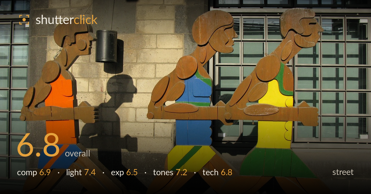
Wooden runners in the sun
Photo by PixelAnarchy

No EXIF metadata in this file
Technical analysis based on visual assessment only.
A well-observed piece of public art photographed in warm, raking light that gives the wooden figures real dimension and casts a strong human shadow behind them. The trio of runners reads as a rhythmic sequence, and the coloured jerseys pop against the muted brick and grid windows. What holds it back is the framing: the leading figure is clipped at the frame edge and the third figure crowds the right side, so the sequence feels squeezed rather than allowed to run. The bright highlights on the brick edge toward blown, and the busy window grid competes for attention.
The three figures form a strong left-to-right rhythm, and the cast shadow of the front runner is the standout detail — a second, ghostly sculpture on the brick. But the framing crowds both flanks: the trailing figure is cut off at the left and the leading figure presses against the right edge, so the run has nowhere to travel. Placing the group with more breathing room ahead of them would give the motion somewhere to go. The window grid behind adds texture but also visual clutter.
Low, warm side light does the heavy lifting here, raking across the carved wood to reveal grain and the layered relief of arms and torsos. The direction also throws that expressive shadow on the brick, which is the frame's best gift. Shadow rendering is crisp and directional, giving the flat figures genuine depth. The trade-off is contrast: the sunlit brick edge runs hot while the shaded left figure sits noticeably darker, so the light rewards one part of the scene at the others' expense.
Exposure is set for the midtones of the sculptures, which keeps the coloured jerseys and wood grain readable. The bright brick pier and its sunlit edge push toward clipping, losing some highlight texture in the stonework at upper centre. The shaded left figure and lower corners hold detail but sit dark. Overall it's a reasonable compromise for a high-contrast scene, though a slightly lower exposure or later recovery would have protected the brick without sacrificing the shadowed figure's readability.
The palette works well: saturated orange, blue, yellow and green jerseys read vividly against the desaturated grey-brown brick and the cool green-tinted windows. White balance leans warm, appropriate to the low sun, and the wood tones feel natural. Contrast is on the strong side, which suits the graphic subject but deepens the shadow areas. The colour relationships are the frame's real appeal — the primary-heavy figures against the neutral architectural backdrop give it energy without feeling garish.
Focus lands cleanly on the sculptures, with the wood grain and painted edges sharp across the plane, and the figures sit close to parallel to the sensor so depth of field is not an issue here. Sharpness holds into the background window grid, suggesting a small-to-moderate aperture and adequate light — noise is not a visible concern in this bright scene. The main technical limitation is not the capture but the framing choices at the edges, which crop the outer figures. The high-contrast light also pushes the dynamic range near its limits, and the brick highlights sit at the edge of recoverable. A polariser could have tamed reflections in the windows and deepened the sky-lit brick, and a step back or a slightly wider focal length would have contained the full sequence with margin. Perspective is largely clean, with the window verticals staying close to true, which keeps the architectural backdrop from distracting further.
What would elevate it
Tags
Shot something like this?
Expert photo critique, on demand — scored across six categories, EXIF-aware. Start with 3 free critiques, no credit card.
critique my photo — free