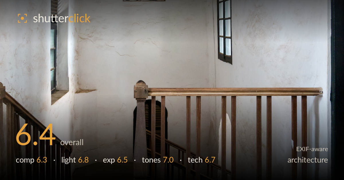
Worn stairwell in soft light
Photo by Matti Blume

| Focal length | 14 mm |
| Aperture | f / 4.0 |
| Shutter | 1/60 s |
| ISO | ISO 800 |
| Exp. comp. | 0.0 EV |
| Shot at | 12:10 · Feb 9, 2023 |
A quiet, atmospheric interior that trades on the texture of aged plaster and worn timber, with soft window light doing the emotional work. The mood is genuine — the muted earthen palette and simple wooden balustrade carry real character. What most holds it back is compositional indecision: the frame juggles two windows, an arched alcove, a stairwell, and the banister without deciding which is the subject, so the eye wanders. Verticals also lean inward from the wide 14mm perspective, and the overexposed ceiling near the light bloom pulls attention upward and out of the frame. Tightening the geometry would sharpen an already evocative space.
The frame packs in competing elements — two windows, an arched alcove, the descending stairs, and the foreground balustrade — without establishing a clear hierarchy, so the eye drifts rather than settles. The wooden railing anchors the lower right nicely and the staircase offers a diagonal, but the empty central wall dominates without paying off. A stronger read would let the banister and stair lead more deliberately. The near-symmetry of the two side walls is undercut by the off-centre stairwell, leaving the composition caught between symmetrical and dynamic.
Soft, diffused daylight from the windows suits the aged surfaces, raking gently across the plaster to reveal its cracks and patches — the texture is the strongest asset here. The pool of brightness on the right wall from the mullioned window adds a welcome focal warmth. However, the ceiling bloom near the top-left is blown and flat, robbing that area of shape, and the overall lighting is even to the point of being slightly listless. A moment with stronger directional shafts through the windows would have given the space more drama.
Exposure is broadly serviceable but the ceiling and the light bloom at upper-left are clipped, losing all detail in the brightest whites. The window panes are also mostly blown, which is hard to avoid but pulls the eye. Shadow detail in the stairwell and darkened doorway on the right holds reasonably, retaining texture in the wood. The midtones on the plaster walls are well placed and carry the tonal weight of the frame. Bracketing or a pull on the highlights would have recovered the ceiling.
The muted, earthy palette is the image's real strength — warm ochre stains against off-white plaster, with the honey-toned timber providing gentle contrast. White balance reads neutral-to-warm and feels true to the space. The restrained saturation matches the aged, abandoned mood well. Contrast is soft, which suits the diffuse light, though the whites verge on washed-out where the ceiling clips. The tonal gradation across the walls is subtle and pleasing, holding the various stains and repairs without turning muddy.
At 14mm on the Micro Four Thirds body (28mm equivalent), the wide angle introduces the expected converging verticals — the side walls lean inward noticeably, which is the chief technical issue for an architectural frame and would benefit from lens-correction and perspective straightening in post. Focus is accurate, with the plaster texture and wood grain resolving crisply where light permits. f/4 provides ample depth of field for this interior, keeping foreground railing and far wall acceptably sharp. ISO 800 is a sensible choice for a handheld dim interior and the noise is well controlled, with clean shadows. 1/60s was fast enough to avoid camera shake at this focal length. Overall the capture is technically sound; the settings are appropriate to the conditions. The main gains lie in post-processing correction of the keystoning and a highlight recovery pass on the clipped ceiling, rather than in the capture itself.
What would elevate it
Tags
Shot something like this?
Expert photo critique, on demand — scored across six categories, EXIF-aware. Start with 3 free critiques, no credit card.
critique my photo — free