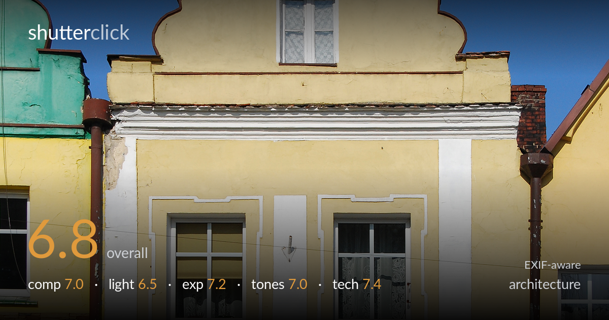
Yellow bakery facade under blue sky
Photo by Jacek Halicki

| Focal length | 32 mm |
| Aperture | f / 4.8 |
| Shutter | 1/3000 s |
| ISO | ISO 200 |
| Exp. comp. | 0.0 EV |
| Shot at | 12:50 · Mar 9, 2014 |
A clean, documentary-style record of a bakery facade with its distinctive curved Dutch-style gable centred and well contained in the frame. The verticals are largely controlled and the building reads honestly against a deep blue sky. What most holds the image back is the flat, frontal late-afternoon light that leaves the ornate gable underplayed, and the tight crop that clips the roof apex at top and crowds the neighbouring buildings at the edges. As a catalogue-style architectural document it succeeds; as a more expressive portrait of the building it would benefit from rakier light and a touch more breathing room.
The gable is centred and symmetry is sensibly used for a frontal facade study, with the building filling the frame and a pleasing strip of paving anchoring the base. Verticals run close to true, important for this genre. The roof apex is clipped at the very top, though, costing the building its crowning point, and the partial neighbouring facades on both sides compete for attention rather than framing cleanly. A fraction more headroom and a more deliberate handling of the edges would let the structure stand on its own.
Light is frontal and fairly even, coming from the upper left, which keeps the facade legible but does little to model the relief of the gable, the stucco trim, or the window surrounds. The decorative scrollwork at the top reads flat because the light grazes too little across it. Shadows under the eaves and signage are clean and not distracting. Earlier or later raking light across the facade would carve out the ornamental detail and give the brickwork and plaster genuine texture and dimension.
Exposure is well judged for a high-contrast situation. The bright yellow plaster holds detail without blowing out, and the dark brown signage and shopfront glass retain information rather than crushing to black. The deep blue sky is rich and unclipped. Highlights on the white window frames sit just under the ceiling. The reflective shop windows are inevitably the darkest zone, but enough of the painted lettering and interior reads through. A balanced histogram with no obvious accidental clipping at either end.
The warm yellow facade plays nicely against the saturated blue sky, a complementary pairing that gives the frame its punch. White balance looks accurate for clear afternoon daylight. Contrast is healthy without being heavy, and the brown signage adds a grounding mid-dark anchor. Saturation in the sky edges toward bold but stays believable. The neighbouring green and red elements at the frame edges introduce slightly jarring color notes. Overall a clean, natural rendering that suits a documentary architectural treatment.
At 32mm on the D80's APS-C sensor (roughly 48mm equivalent) the perspective is natural and avoids exaggerated distortion, a sound choice for a single facade. f/4.8 delivers ample depth of field across a flat subject at this distance, so everything from signage to gable is acceptably sharp. ISO 200 keeps noise negligible and tonal quality clean. The 1/3000s shutter is far faster than needed for a static building handheld in bright light — stopping down to f/8 and dropping the shutter accordingly would have improved edge-to-edge sharpness and lens performance with no penalty. Focus is accurate on the facade plane. Verticals are close to corrected, suggesting a careful camera position, though a slight backward lean is visible at the top of the gable. For strict architectural work a tripod and either a shift lens or deliberate perspective correction in post would tighten the convergence further. Solid, dependable execution overall.
what would elevate it
tags
Shot something like this?
Expert photo critique, on demand — scored across six categories, EXIF-aware. Start with 3 free critiques, no credit card.
critique my photo — free